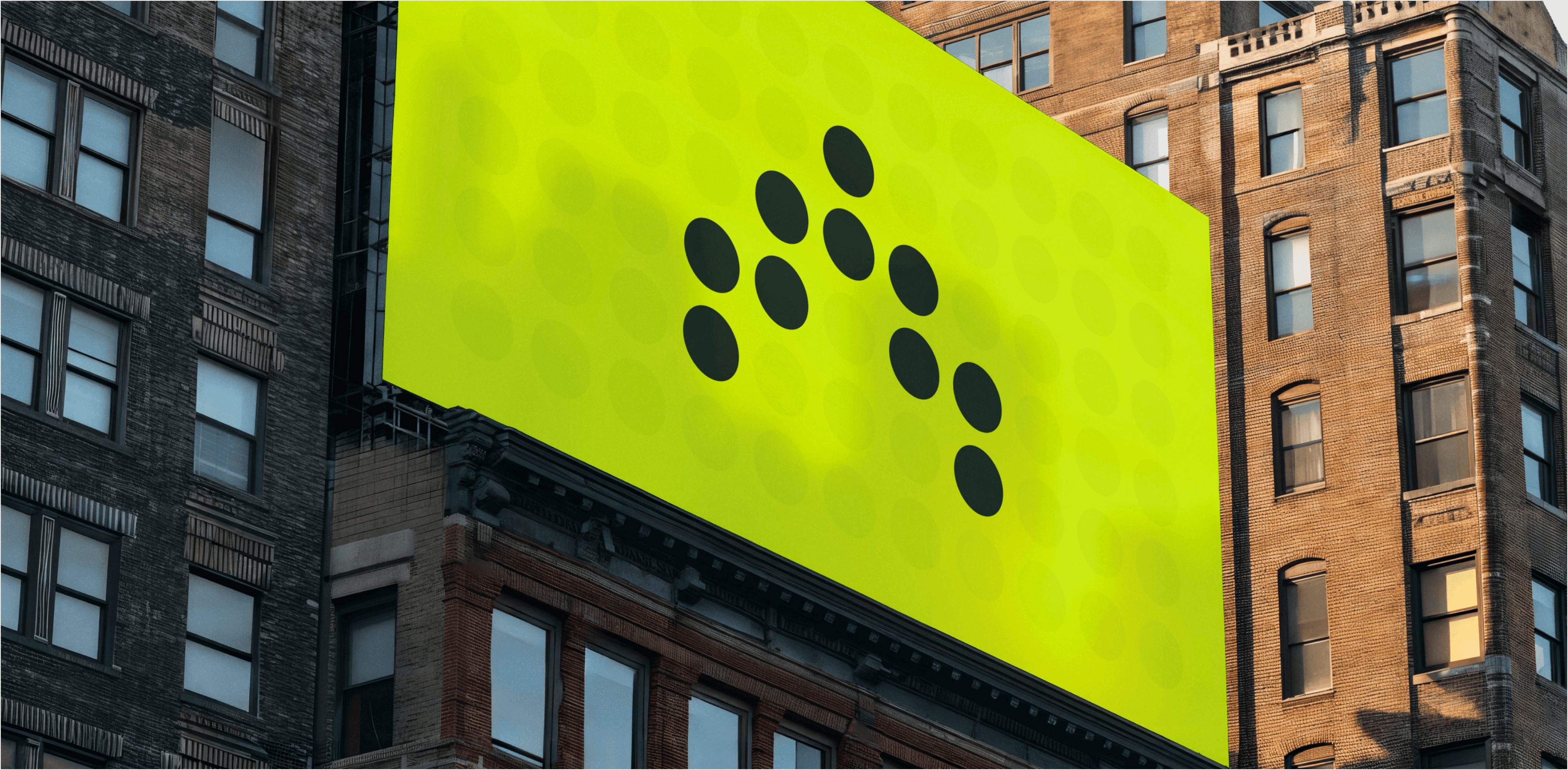
A large, bright green billboard with a minimalist design featuring black dots arranged in a pattern, displayed on the side of a tall urban building. The billboard stands out against the surrounding brick and concrete structures, with windows and architectural details visible.
A bright neon yellow square logo with nine black dots arranged in a pyramid-like formation. The dots are evenly spaced, forming a triangular shape, with one dot at the top, followed by a row of two dots, then three dots, and finally three dots at the base.

Antimetal

Antimetal

Antimetal

By identifying design flaws and UX opportunities, our aim was to elevate the user journey seamlessly.

What we did

UX/UI Design Website Design Product Management

Year completed

2023

Project

Smarter AWS Cloud Cost Optimization

Antimetal optimizes AWS usage with AI, offering a solution to mitigate costs and avoid long-term commitments. By analyzing AWS usage patterns, Antimetal procures services tailored to specific needs, saving money and preventing lock-ins. Through a secondary marketplace, they automate the buying, selling, and transferring of reserved contracts, ensuring a win-win-win scenario for AWS customers.

A bright neon yellow billboard against a clear blue sky features the Antimetal logo and the text "Overspending on AWS was a ZIRP." The simple design with bold black letters aims to draw attention to AWS cost management. The billboard is mounted on a metal structure with floodlights and a small sign from the advertising company PUBLIEX.
A dark-themed app icon with a grid background featuring the Antimetal logo. The logo consists of small neon yellow dots arranged in an upward-pointing arrow shape. The icon has rounded corners and is centrally positioned within the image.

Challenge

Antimetal's Redesign Odyssey

While redesigning Antimetal's product and website, our team encountered the captivating challenge of adhering to comprehensive guidelines dictating their logo and color scheme. This task wasn't just intriguing; it was pivotal in crafting mutually balanced products, harmonizing functionality with visual style.

Visual displaying the main font 'TWK Lausanne' in a large 'Aa' with a green gradient background. Below the large 'Aa,' smaller text examples of the font are shown, including uppercase and lowercase letters, numbers, and symbols.
Color palette visual featuring five color swatches: Chartreuse (#d9fa0e), White smoke (#f5f5f5), Cadet gray (#9d9d9d), Davy's gray (#4c4c4c), and Raisin black (#27272b). Each swatch is labeled with its corresponding name and hex code.
Black laptop displaying Antimetal's website on a yellow wireframe surface. The screen highlights 'Smarter cloud cost optimization' with the claim of saving up to 75% on AWS. Trusted by companies like Wiza, Upshot, Politico, and others, the website invites users to preview savings.

Solutions

Unifying Style Across Website and Product Design

One of the most captivating challenges in this endeavor was establishing a unified visual style for both the website and the product. We opted for a simple, light, structured aesthetic that echoed the company's vision. Furthermore, we extended this style beyond the website's structure to encompass various materials, including article covers, photos, and presentations.

Visual with a dark background showcasing Antimetal's features. It highlights a 'Powerful AI Prediction Model' for accurate usage forecasting, 'Frictionless Commitment Transfers' for automated RI transfers, and 'Underutilization Insurance' to protect against underutilization. The graphics include line charts and transfer illustrations in green and yellow tones.
Visual with a dark background, displaying a three-step savings process. Step 3, 'Start saving,' is highlighted. Below it, a semi-circular progress indicator in neon green and gray shows savings of $154,532, representing 72.1% of monthly spend, with a 20% increase.
Bright visual with a neon green background. The main text reads, 'Save 75% on AWS in 2 minutes.' Subtext highlights automation of cloud savings without contracts or engineering requirements. A prominent 'Preview Savings' button is centered below the text. The bottom section displays a dashboard screenshot with savings metrics.

Streamlining Information Across Pages

With a multitude of pages on the site, our aim was clarity without overwhelming detail. We focused on key elements to deliver comprehensive user information efficiently. To maintain coherence amidst the vast information, we melded new elements with familiar layouts and blocks, ensuring consistency across pages. Our structured approach included creating uniform hero banners, differing only in textual content and visual representation. Each graphic detail was meticulously balanced with style while visualizing text presented a distinct interface challenge seamlessly integrated with the product's design ethos.

Laptop displaying a countdown timer for 'Antimetal 2.0.' The timer shows 13 days, 13 hours, 13 minutes, and 50 seconds remaining. The screen has a dark background with green wave graphics at the top, and a 'See the plans' button below the countdown.
Visual showing the 'Antimetal Ticket Giveaway' during the launch week. Users claimed digital tickets to participate in daily prize draws. The image features five digital tickets with names and handles of winners: Zain Aminoff, Maria Vetrovs, Miracle Stanton, and two others, each ticket dated between April 10th and April 12th, 2023.
Image featuring a fighter jet with a quote saying, 'Antimetal optimizes our cloud spend without compromising on security.' Below the quote is a profile picture of Nicolas Chaillan, identified as the Former U.S. Air Force and Space Force Chief Software Officer (CSO), along with the Antimetal logo.

“Rasa Design is a great team to work with — they deliver on time, are great communicators, and overall, they were amazing to work with. Their communication was A+.”

Matthew Parkhurst

Co-FOUNDER & CEO AT ANTIMETAL

Creating a Visually Striking Launch Webpage

Crafting a webpage for Antimetal Launch Week presented a unique challenge: standing out while staying true to the brand's identity. We opted for a bold approach, contrasting deep black with vibrant splashes of the brand's bright green color. This juxtaposition created visual intrigue while maintaining coherence with the overall brand aesthetic. Despite the tight timeline, we successfully delivered a standout page that captured attention and set the stage for a successful launch.

Visual for the Antimetal Blog, featuring a green gradient background with the text 'Antimetal Blog - The latest in security, access control, IT compliance, and Twingate news.' Below, there's a highlighted section with the title 'Introducing Antimetal.' The Antimetal logo is positioned at the top center.
Two men wearing Antimetal caps and lanyards stand in front of a bright yellow advertisement for Antimetal. The ad promotes saving up to 75% on AWS bills in just 2 minutes and features QR codes for more information. The background includes text about Antimetal’s services and is set against a cityscape with tall buildings.

We extend our heartfelt gratitude to Matthew Parkhurst for his outstanding collaboration and invaluable insights throughout this project. Our sincere appreciation to Tani Dyhdalo, Yuliia Samoilenko, and Rosty Volchak for their exceptional design expertise and unwavering professionalism.

Subscibe to RDT Newsletter

So rare, it’s not yet in existence.

You could be the first to read... well, something, eventually.

© 2024 Rasa Design Team

All rights reserved

Subscibe to RDT Newsletter

So rare, it’s not yet in existence.

You could be the first to read... well, something, eventually.

© 2024 Rasa Design Team

All rights reserved

Subscibe to RDT Newsletter

So rare, it’s not yet in existence.

You could be the first to read... well, something, eventually.

© 2024 Rasa Design Team

All rights reserved