Our collaboration with Audiotease has made this innovative tool a reality, empowering podcasters to capture wider attention and grow their listener base.
What we did
Branding UX/UI Design Website Design Product Management
Year completed
2022
Project
Where Podcasts Meet Virality
Audiotease offers a lifeline for podcasters struggling to stand out in a crowded market. Many start podcasting fueled by passion, aiming to connect with a global audience. Yet, they often find themselves voiceless in the vast sea of content. The pain point? "Boosting my audience seems impossible in the swarm of existing podcasts, especially without the initial buzz." Audiotease is the solution. This web application transforms podcast highlights into engaging videos, helping creators to amplify their reach.
Challenge
Unlock the Power of Podcasts
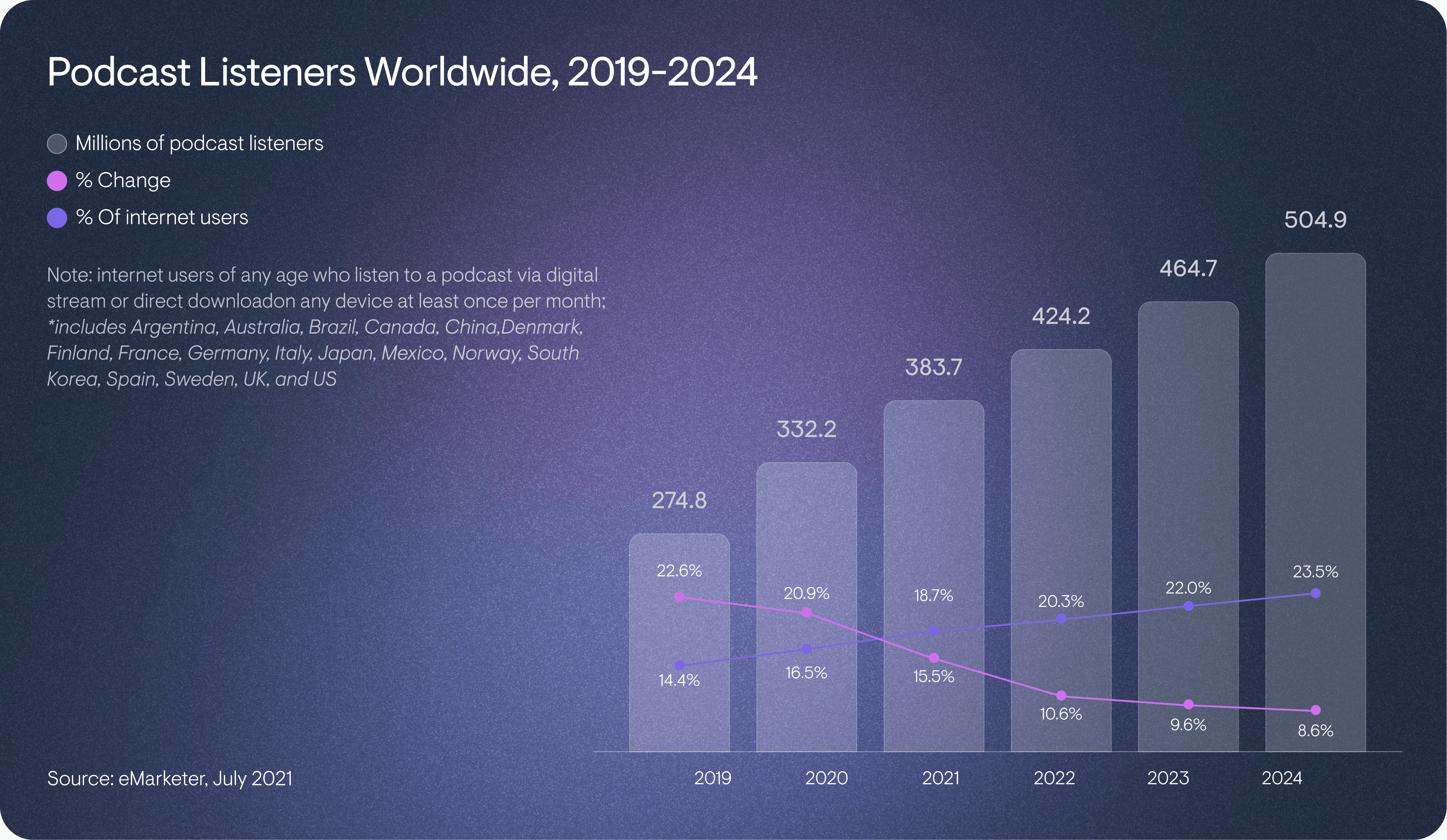
In response to this booming industry, the Audiotease team has set its sights on simplifying the podcasting journey for creators. How? By enabling them to effortlessly enhance their podcast's presence on social media with visually engaging audiograms, Audiotease is paving the way for creators to tap into and capitalize on the podcasting boom. In creating Audiotease's web application, we embraced the challenge as an opportunity to innovate, solve problems, and contribute to the dynamic world of podcasting.
Solutions
Bold Colors, Elegant Fonts
Audiotease combines vibrant colors and elegant typography for a standout brand in podcasting. Purple for success, blue for communication, and pink for playfulness contrast with a minimalist black and white backdrop, embodying the brand's innovation. The use of sleek fonts establishes a clear hierarchy, making the brand's message compelling and easy to navigate. Audiotease's identity is dynamic and inviting, designed to empower podcasters to make their mark.
Personalize Your Sound with the Brand Kit
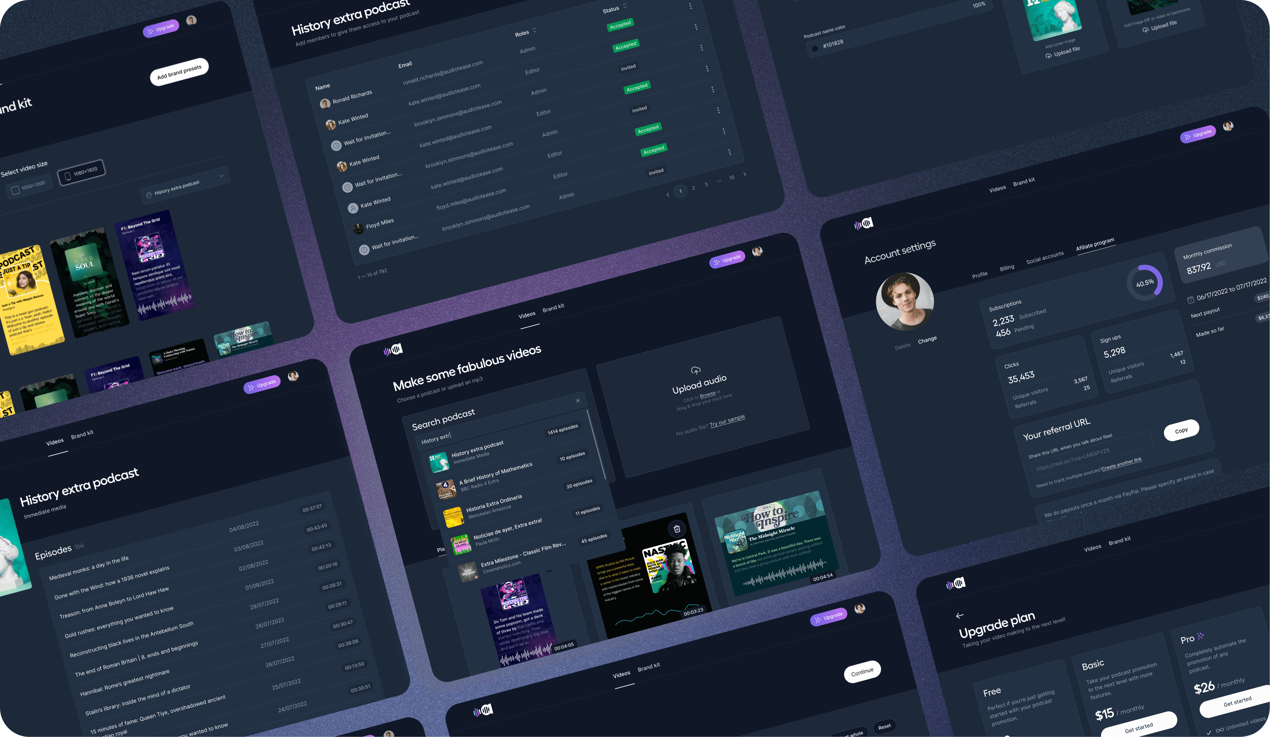
We refined Audiotease with a focus on simplicity and user experience, introducing a brand kit feature for easy customization. Users can now personalize their audiograms with logos, fonts, colors, and more. Ideal for teams or creating custom templates, this feature ensures every audiogram showcases the creator’s unique brand identity.
“They really understand how to make a beautiful and effective UI/UX design.”
Julien de Bats
FOUNDER & CEO AT AUDIOTEASE
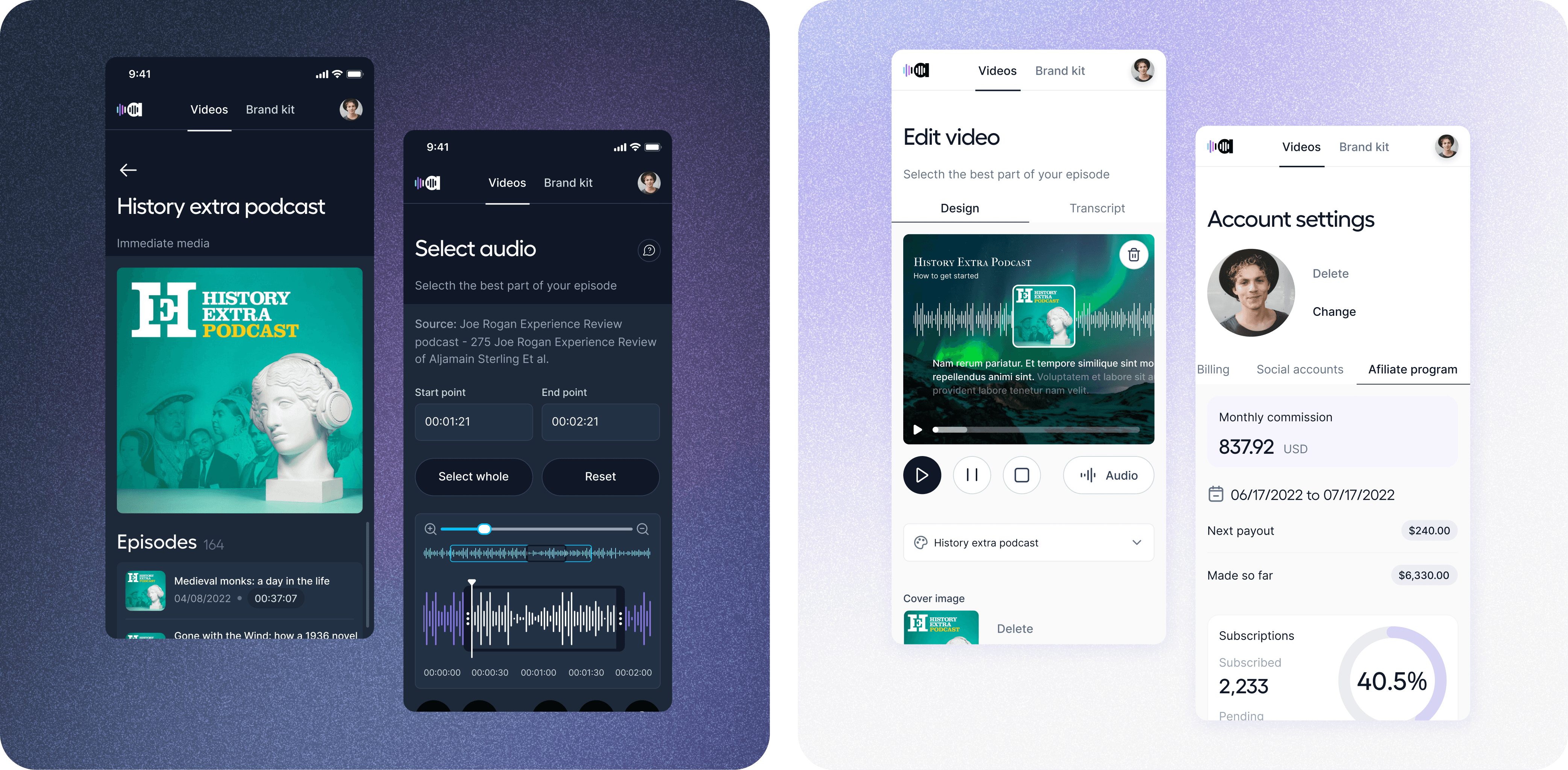
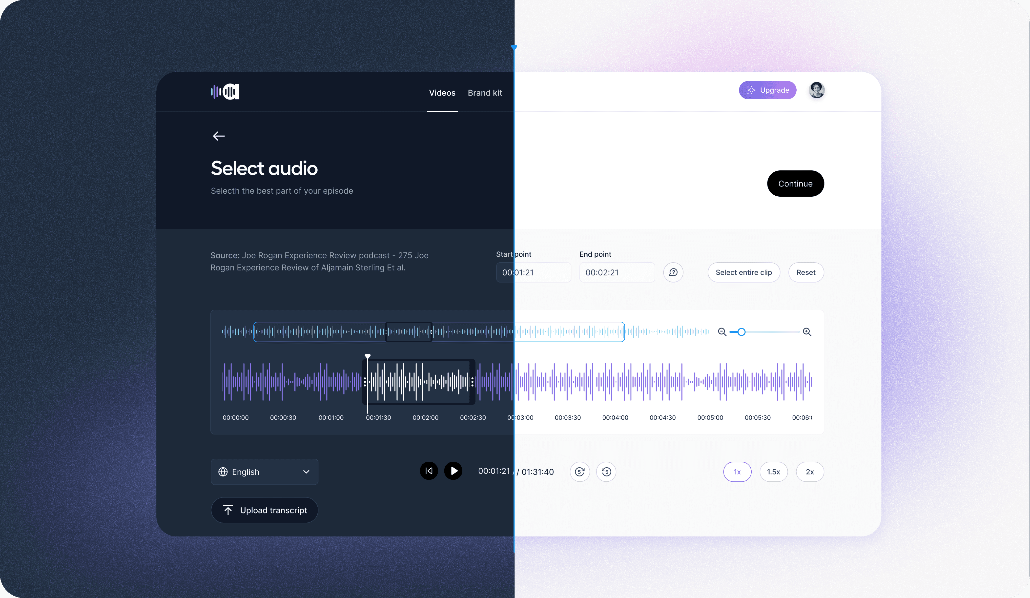
Choose Your View: Light and Dark Modes
Recognizing the significant impact of interface customization on user experience, we introduced a dark mode feature for several compelling reasons. First, it's more energy-efficient, reducing power consumption. Second, using dark mode can mitigate potential long-term effects linked to prolonged exposure to light screens. Lastly, dark mode offers improved accessibility for individuals with visual impairments, enhancing usability and comfort. This thoughtful addition underscores our commitment to user-centric design, offering a tailored experience that meets diverse needs and preferences.
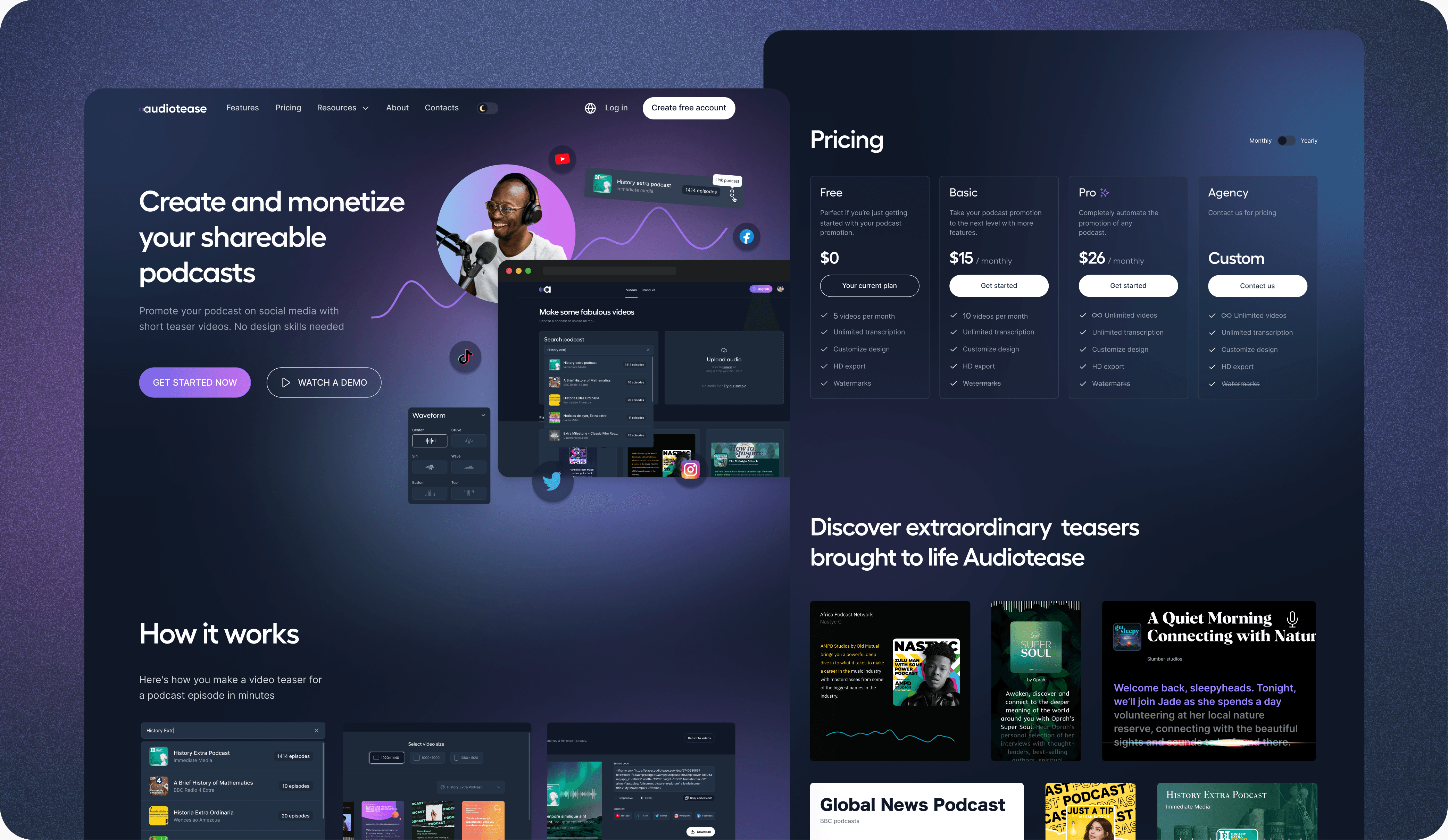
A New Digital Experience
We launched a marketing-boosting website that showcases the product's advantages through vivid screenshots. Our design prioritizes negative space for a clean, breathable layout, enhancing readability with well-placed, reassuring headers for a smooth reading flow. The dynamic, structured layout injects energy into the user experience. Additionally, we've incorporated light and dark mode options, allowing users to switch effortlessly for optimal viewing comfort.