A large outdoor billboard featuring a healthcare advertisement. On the left side, there's an image of a smiling female doctor in a white lab coat, with medical icons overlayed, including "Medications list," "Hospital Encounters," and "Additional Risk Factors." Next to her, a blue section lists conditions like "Congestive Heart Failure," "Recent Inpatient Admission (Post-Discharge)," and "Moderate Risk."  On the right side of the billboard, there is a clean white section with the logo of ChamberCardio and the tagline "Improved Cardiovascular Health for All." A laptop screen displays a detailed health dashboard, suggesting the use of digital tools for monitoring and managing cardiovascular health. The overall design promotes accessible and improved health care with a focus on technology-driven solutions.
A minimalistic logo with a light background and a bold pink letter "C" in the center. The "C" has a heart shape integrated into its design, with a small reflection on the heart, giving it a soft, glossy appearance. The design is clean and modern, likely representing health, wellness, or care-related branding. The vibrant pink color contrasts well against the light background, making the logo visually striking.

Chamber Cardio

Chamber Cardio

Turning fragmented cardiology data into a unified care dashboard.

What we did

Branding
UX/UI Design
Product Management

Year completed

2024

Chamber Cardio helps cardiology teams operate in a value-based care model — coordinating between cardiologists, payers, PCPs, and patients to deliver the right care at the right time. The problem: everyone was frustrated. Cardiologists prioritized volume over outcomes, health plans couldn't align incentives, PCPs struggled to reach top specialists, and patients got fragmented care.

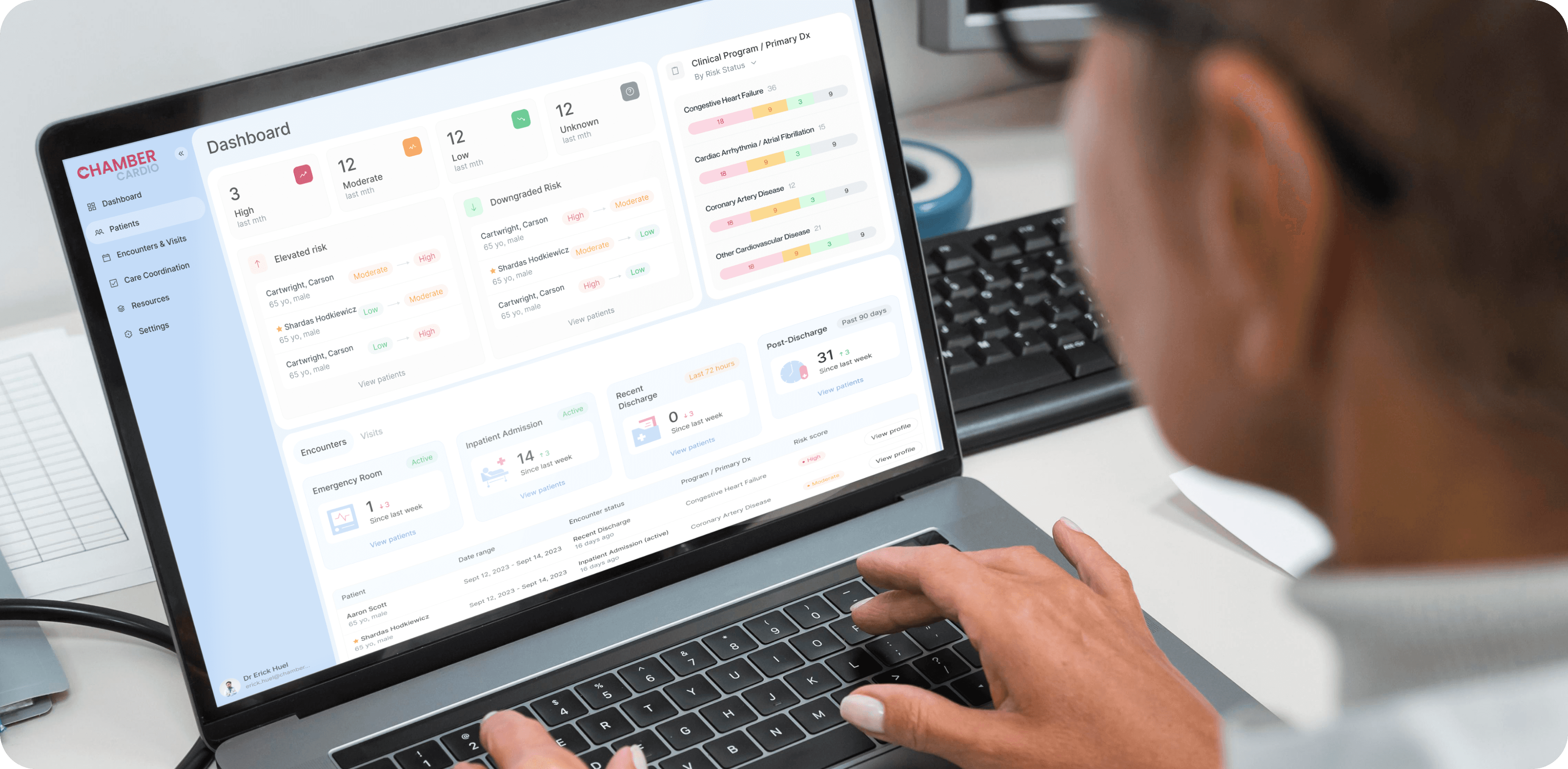
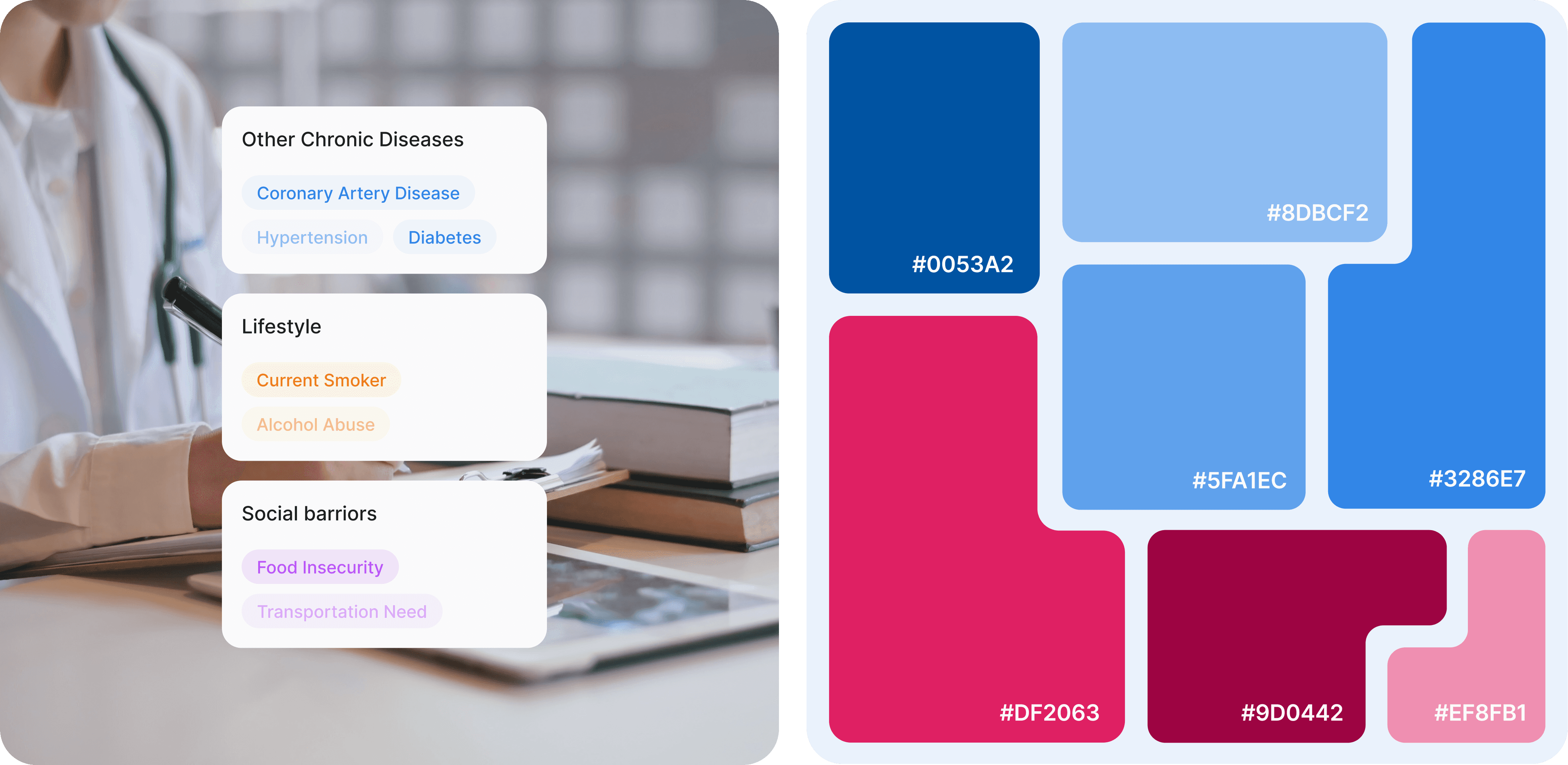
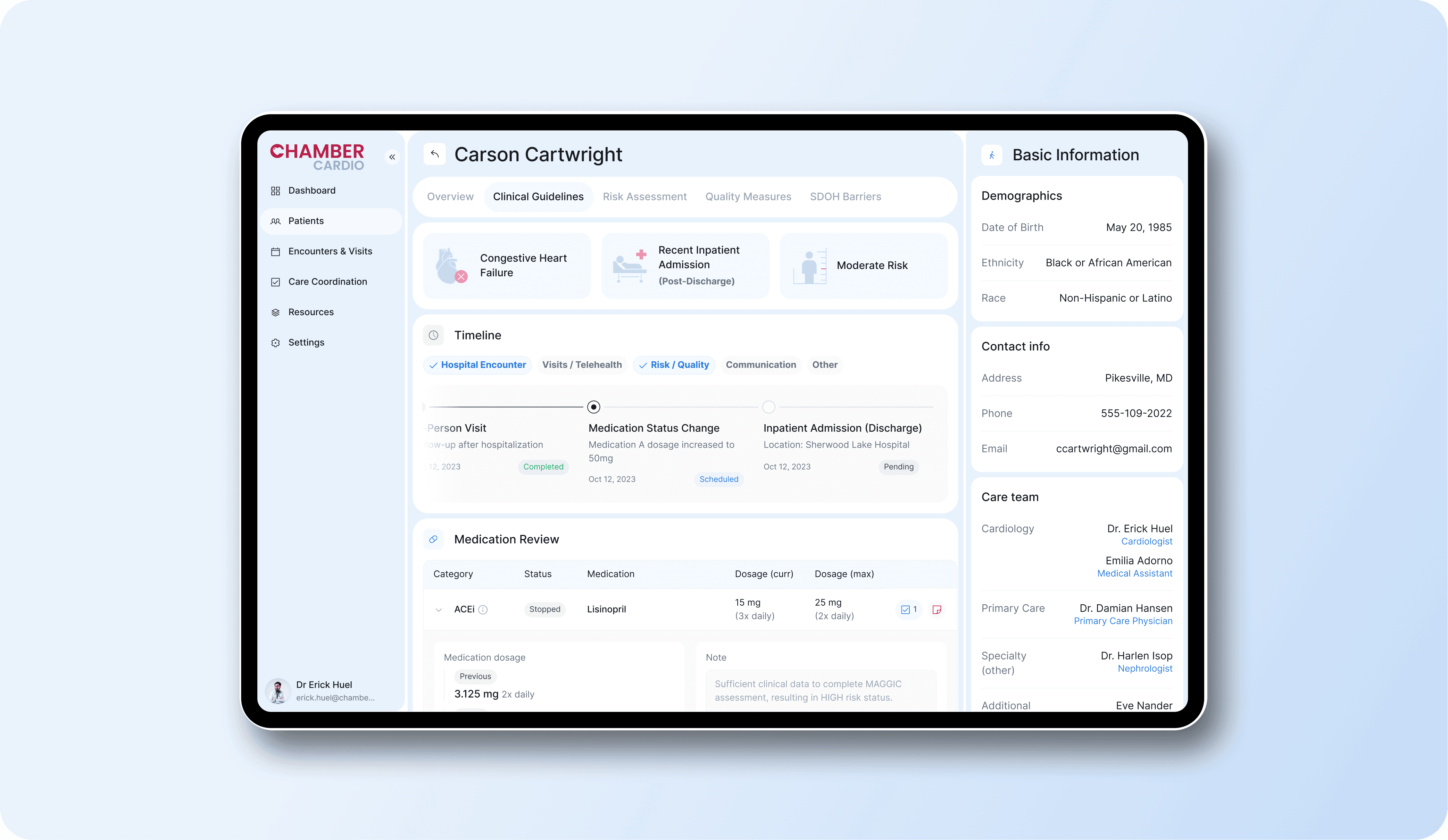
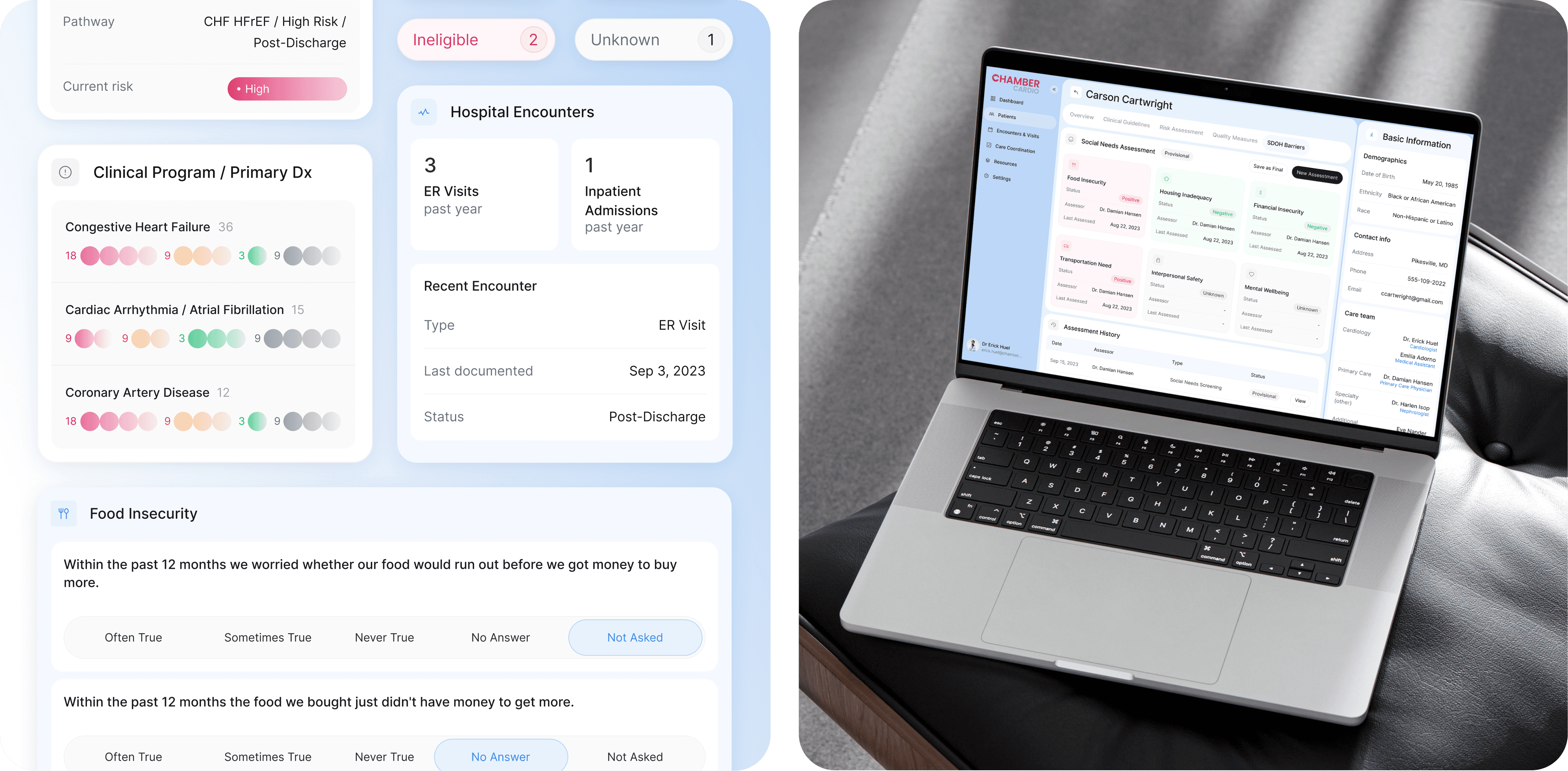
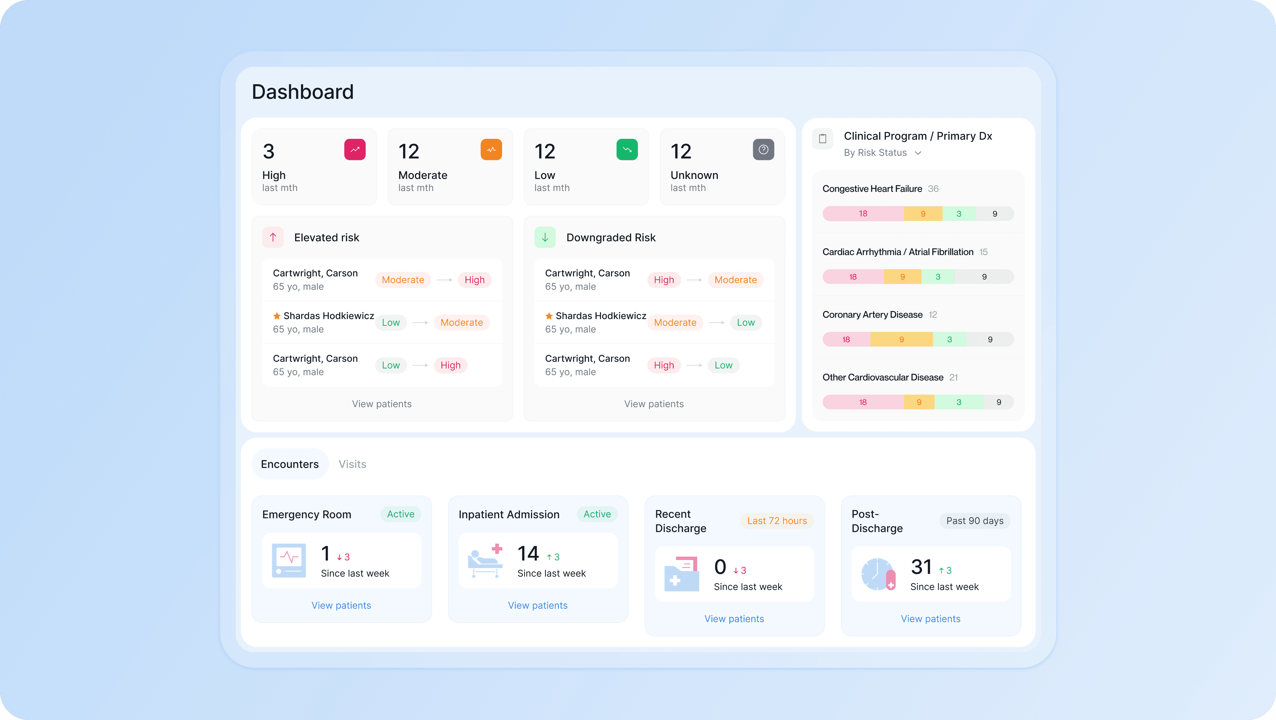
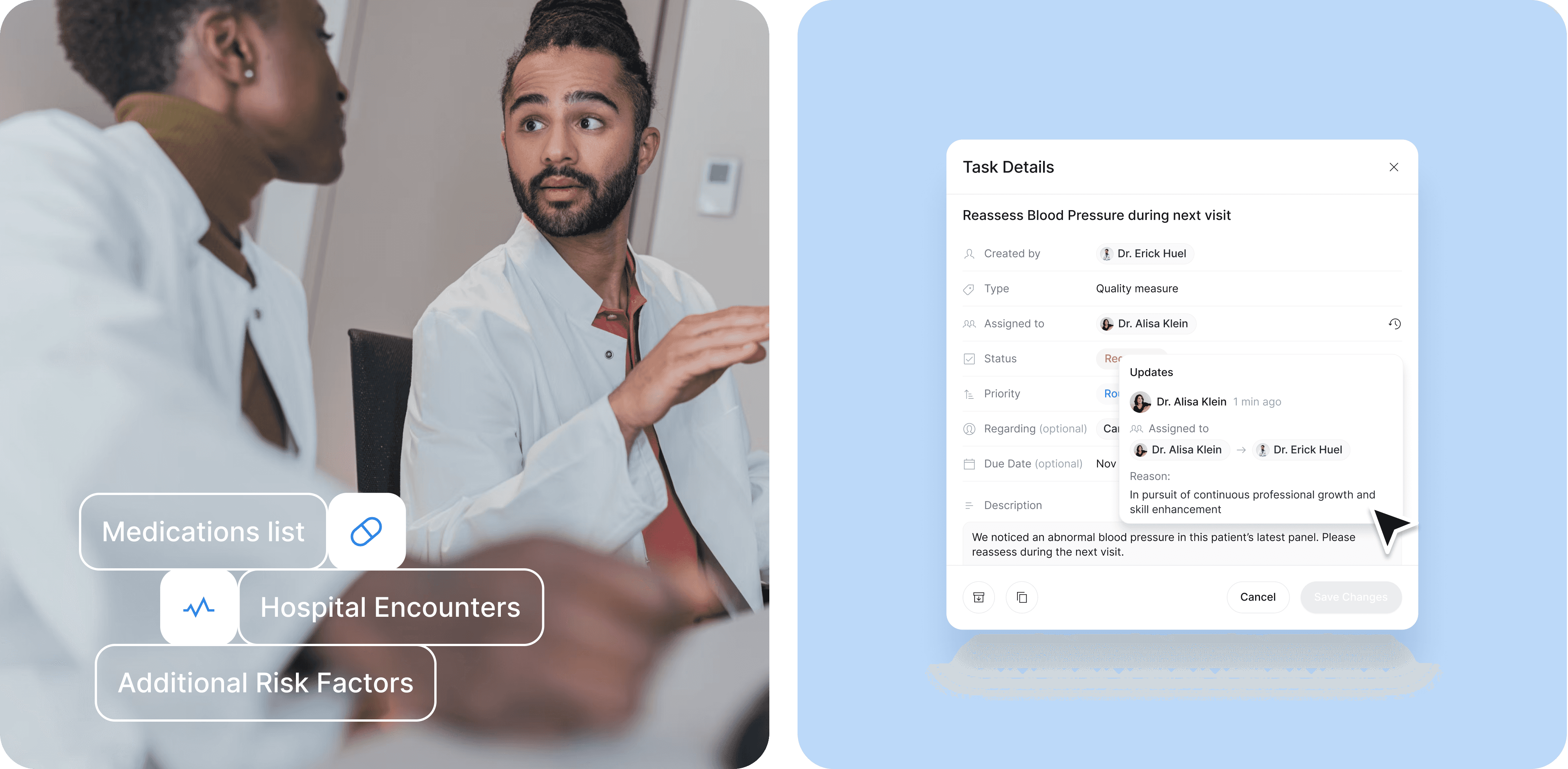
We redesigned the platform to give care teams one clear view of what matters. The patient profile puts diagnosis and risk level up front, with medications, encounters, and care history organized into tabs that don't bury the basics — name, contact, demographics stay fixed on the left as you navigate. We used expand/collapse patterns throughout to keep dense information manageable: medication tables show the essentials at a glance, then reveal dosage history, allergies, and task notes on click. The dashboard uses compact cards and tabs instead of endless scrolling. Messages got avatars and logos to distinguish senders at a glance, with quick actions — read, archive, flag, assign — built right into the table. Task management focuses on re-assignment and status changes, with hover states showing full history.

The result: a system that scales with complexity without overwhelming the people using it. Clear enough for quick decisions, detailed enough for coordinated care.

A simple blue gradient background featuring a white logo in the center. The logo consists of the letter "C" with a heart shape integrated into the letter, symbolizing health or care. The heart has a small reflection, giving it a three-dimensional look. The design is clean and modern, representing a brand or company related to cardiovascular or healthcare services.
A close-up image of a person using a laptop displaying a health management dashboard. The interface on the screen belongs to ChamberCardio and is organized into various sections, including:  Risk Levels: "High," "Moderate," "Low," and "Unknown" categories for patients based on their clinical data. Encounters and Visits: Tracking recent visits to the emergency room, inpatient admissions, and discharges. Clinical Program/Primary Diagnosis: Monitoring conditions such as "Congestive Heart Failure," "Coronary Artery Disease," and other cardiovascular diseases. The dashboard provides a clear, organized overview of patient data, enabling healthcare professionals to monitor risks and patient encounters efficiently. The layout is user-friendly with soft colors, charts, and labeled sections, emphasizing the use of technology in healthcare management.
 A color palette visual displaying seven distinct color blocks, each labeled with its corresponding hex code. The blocks are arranged in an irregular, grid-like format with rounded corners. The colors included are:  #0053A2: A deep blue. #8DBCF2: A light blue. #3286E7: A vibrant medium blue. #5FA1EC: A bright sky blue. #DF2063: A bold pink. #9D0442: A deep burgundy. #EF8FB1: A soft pink. The overall design is clean and modern, showcasing a harmonious blend of blues, pinks, and reds. This color palette is likely intended for branding, UI design, or a specific project requiring consistent color usage.
A tablet screen displaying a detailed patient dashboard from ChamberCardio. The interface shows medical information for Carson Cartwright, organized into sections:  Clinical Overview: Conditions listed include "Congestive Heart Failure," "Recent Inpatient Admission (Post-Discharge)," and "Moderate Risk." Timeline: Shows key medical events such as hospital encounters, visits, medication status changes, and inpatient admission/discharge dates. Medication Review: Lists specific medications, their dosage, and status (e.g., ACEI - Lisinopril, dosage adjustments noted). Basic Information: Displays the patient's demographics, including date of birth, ethnicity, race, and contact information. Care Team: Lists healthcare professionals, such as the cardiologist Dr. Erick Huel, primary care physician Dr. Damian Hansen, and other specialists involved in care. The dashboard is cleanly designed with a light background, soft blue highlights, and clear text, making it easy for medical professionals to access important patient data quickly. The layout is structured for efficiency and clarity in clinical settings.
A medical dashboard interface displaying various patient health data. Key sections include:  Pathway: CHF HFrEF / High Risk / Post-Discharge, indicating a high-risk patient with Congestive Heart Failure. Risk Level: Marked as "High" with a pink indicator. Clinical Program / Primary Dx: Displays the conditions "Congestive Heart Failure," "Cardiac Arrhythmia / Atrial Fibrillation," and "Coronary Artery Disease" with color-coded risk levels (red, yellow, green, and grey circles) showing the severity and status of each condition. Hospital Encounters: Shows "3 ER Visits" and "1 Inpatient Admission" in the past year, with details of the most recent encounter being an ER visit on September 3, 2023, labeled as "Post-Discharge." Food Insecurity: Questions related to food insecurity within the past 12 months. The user can select from options such as "Often True," "Sometimes True," "Never True," "No Answer," and "Not Asked." The design uses light colors and minimalistic icons, providing a clear, organized view of the patient's medical history and risk factors. It highlights patient social barriers such as food insecurity in addition to clinical data. The user interface is structured for healthcare providers to make quick, informed decisions.
A clean and organized healthcare dashboard interface showing patient health data and risk assessments. Key sections displayed include:  Risk Overview: Categorizes patients into "High," "Moderate," "Low," and "Unknown" risk levels. There are 3 high-risk, 12 moderate-risk, 12 low-risk, and 12 unknown-risk patients. Elevated Risk: Lists patients like Carson Cartwright and Shardas Hodkiewicz, showing their progression between risk categories (e.g., from Moderate to High or Low to Moderate). Downgraded Risk: Displays patients whose risk levels have improved. Clinical Program / Primary Dx: Shows conditions such as "Congestive Heart Failure," "Cardiac Arrhythmia/Atrial Fibrillation," "Coronary Artery Disease," and "Other Cardiovascular Diseases." Each condition is color-coded by risk severity (Red = High, Yellow = Moderate, Green = Low, Grey = Unknown). Encounters: Tracks recent patient activity, including emergency room visits (1 ER visit since last week), inpatient admissions (14 admissions), recent discharges (0 in the last 72 hours), and post-discharge status (31 patients in the past 90 days). This dashboard layout uses soft pastel colors and easy-to-read icons to make patient risk levels and encounters accessible and clear for healthcare providers. The structure is designed for efficient tracking and management of patient care.
An image of two healthcare professionals engaged in discussion, likely collaborating on a patient case. Both are wearing lab coats, indicating a clinical environment. Overlaid on the image are three key medical categories with icons:  Medications list: Represented with a pill icon. Hospital Encounters: Represented with a heart rate icon. Additional Risk Factors: Listed without an icon. The professionals are focused on exchanging information, with the overlay emphasizing critical elements of patient care. The overall design suggests a collaborative approach to evaluating and managing patient health, focusing on essential medical records and encounters.

A big shoutout to Andrew Dilling — an experienced product leader with a passion for leveraging technology to improve people's health and wellbeing — for the incredible collaboration throughout the entire process. Huge thanks to Darina Khomenko, Artur Kogut, and Rosty Volchak for their dedication to bringing this idea to life with user-centered design. Your innovative solutions have transformed the product into something truly compact and visually stunning.

Subscribe to RDT Newsletter

So rare, it’s not yet in existence.

You could be the first to read... well, something, eventually.

© 2026 Rasa Design Team

All rights reserved

Subscribe to RDT Newsletter

So rare, it’s not yet in existence.

You could be the first to read... well, something, eventually.

© 2026 Rasa Design Team

All rights reserved

Subscribe to RDT Newsletter

So rare, it’s not yet in existence.

You could be the first to read... well, something, eventually.

© 2026 Rasa Design Team

All rights reserved