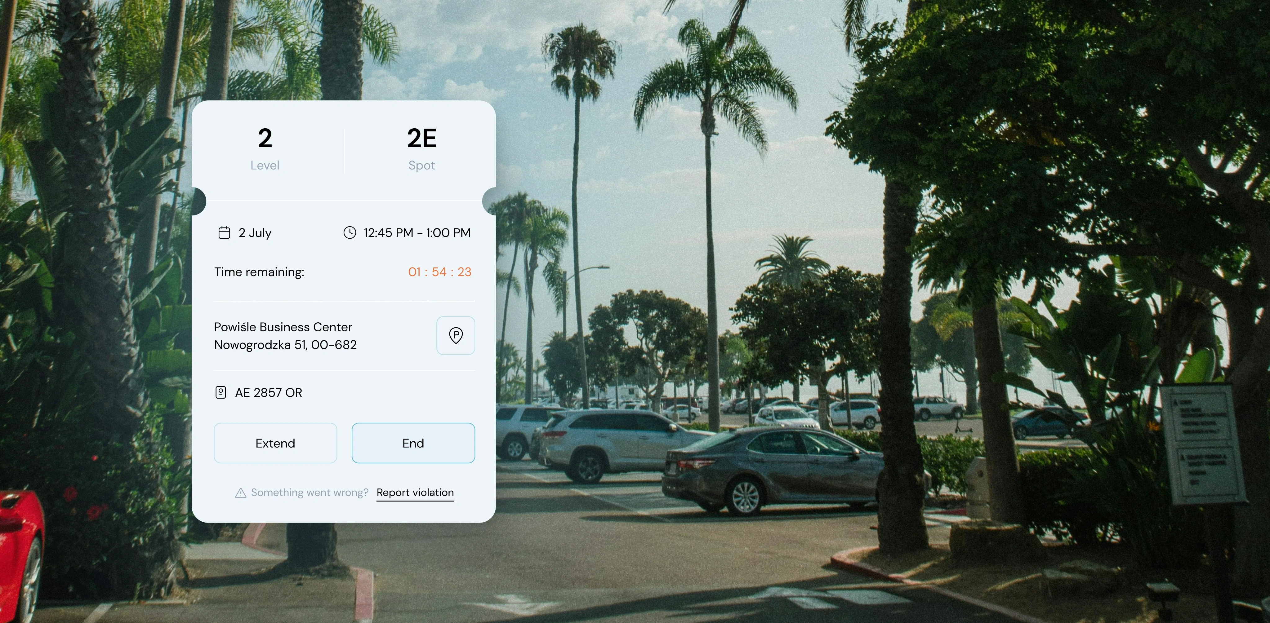
A parking interface displayed on a smartphone screen over a background of a sunny palm tree-lined parking lot. The interface shows details for a parking session on Level 2, Spot 2E, with a remaining time countdown of 1 hour 54 minutes and 23 seconds. The parking location is listed as Powiśle Business Center, Nowogrodzka 51, 00-682, with a car license plate AE 2857 OR. There are buttons to "Extend" or "End" the session, and an option to "Report violation" if something goes wrong.
Minimalist favicon featuring a black letter 'P' centered on a white square background.

Parkiza

Parkiza

Parkiza

Designed for simplicity and inclusivity, this parking app streamlines space management for administrators and booking for workers, enriching the user experience across all ages.

What we did

Branding UX/UI Design Product Management

Year completed

2023

Project

Parkiza's Smart Parking Solution

In today’s fast-paced world, securing a parking spot near your office can be the highlight of your day. With Parkiza, that convenience is just a few taps away on your mobile device. This cutting-edge application streamlines the process of managing parking spaces within office buildings, offering unparalleled ease and flexibility.

A yellow car parked in an empty parking garage, occupying one of the many available spaces marked by yellow lines.
Close-up of a mobile device screen showing a dock with three app icons: a white square with a black 'P', the Safari browser icon, and the Apple Music icon.

Challenge

Navigating Dual User Needs

Designing a specialized office application to manage parking space was a multifaceted challenge that required a nuanced approach. Our goal was to create a solution that not only streamlined the process of allocating and managing parking spots but also resonated with a diverse user base.

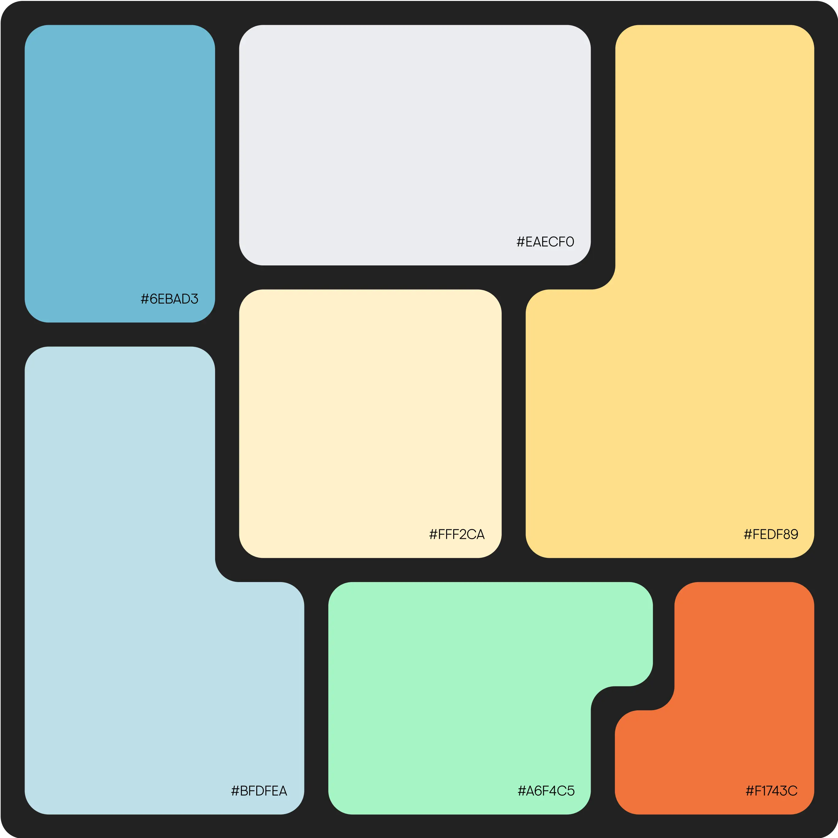
A grid of variously shaped and colored blocks with rounded corners, each labeled with a hexadecimal color code. The colors and their codes are as follows: a light blue block (#6EBAD3), a pale blue block (#BFDFEA), a very light grey block (#EAECF0), a cream block (#FFF2CA), a pastel yellow block (#FEDF89), a mint green block (#A6F4C5), and an orange block (#F1743C).
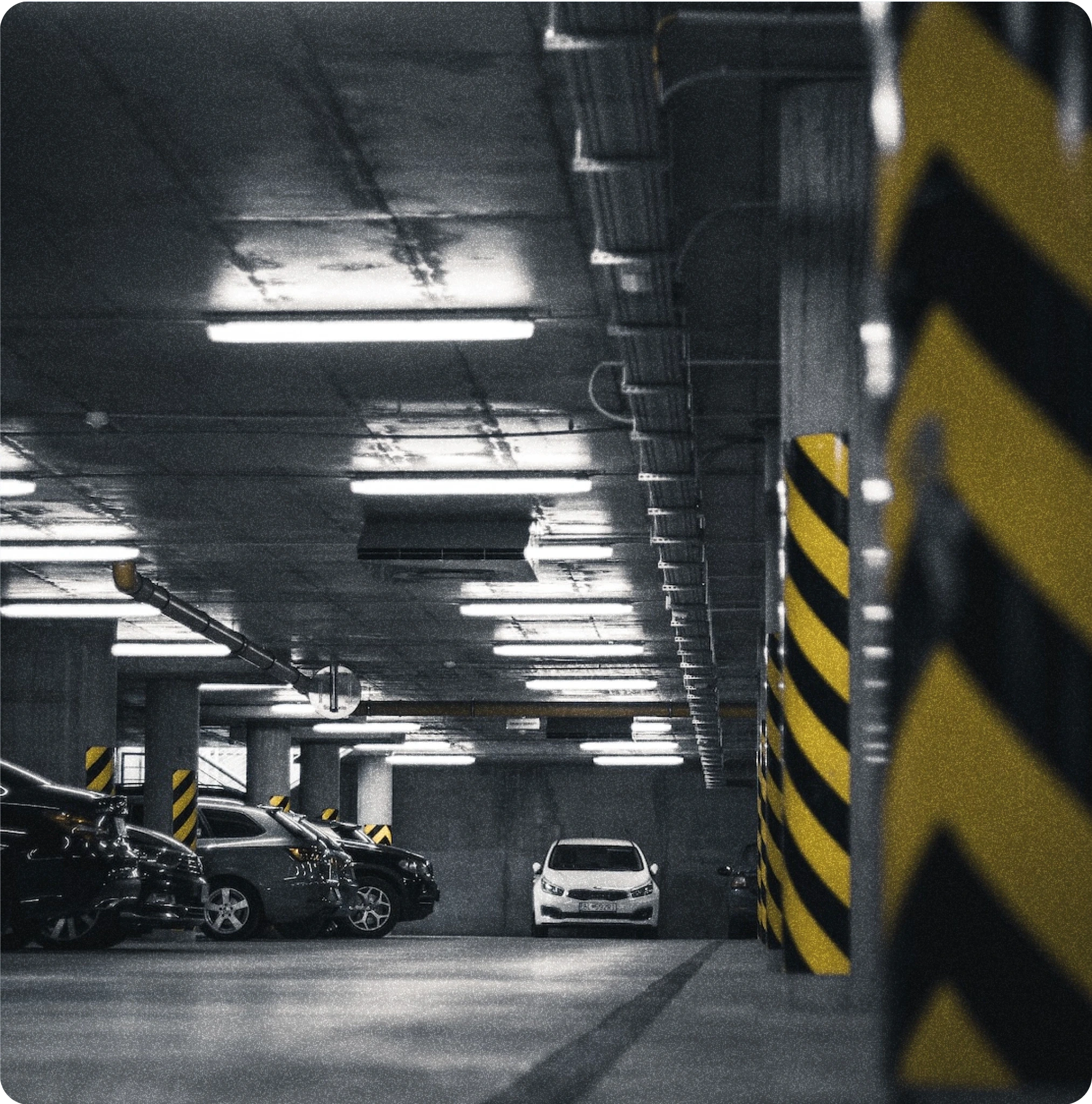
A dimly lit underground parking garage with several parked cars. The ceiling is lined with fluorescent lights, and the concrete pillars are marked with black and yellow hazard stripes. The foreground shows empty parking spaces, while the background reveals a white car parked in the distance.
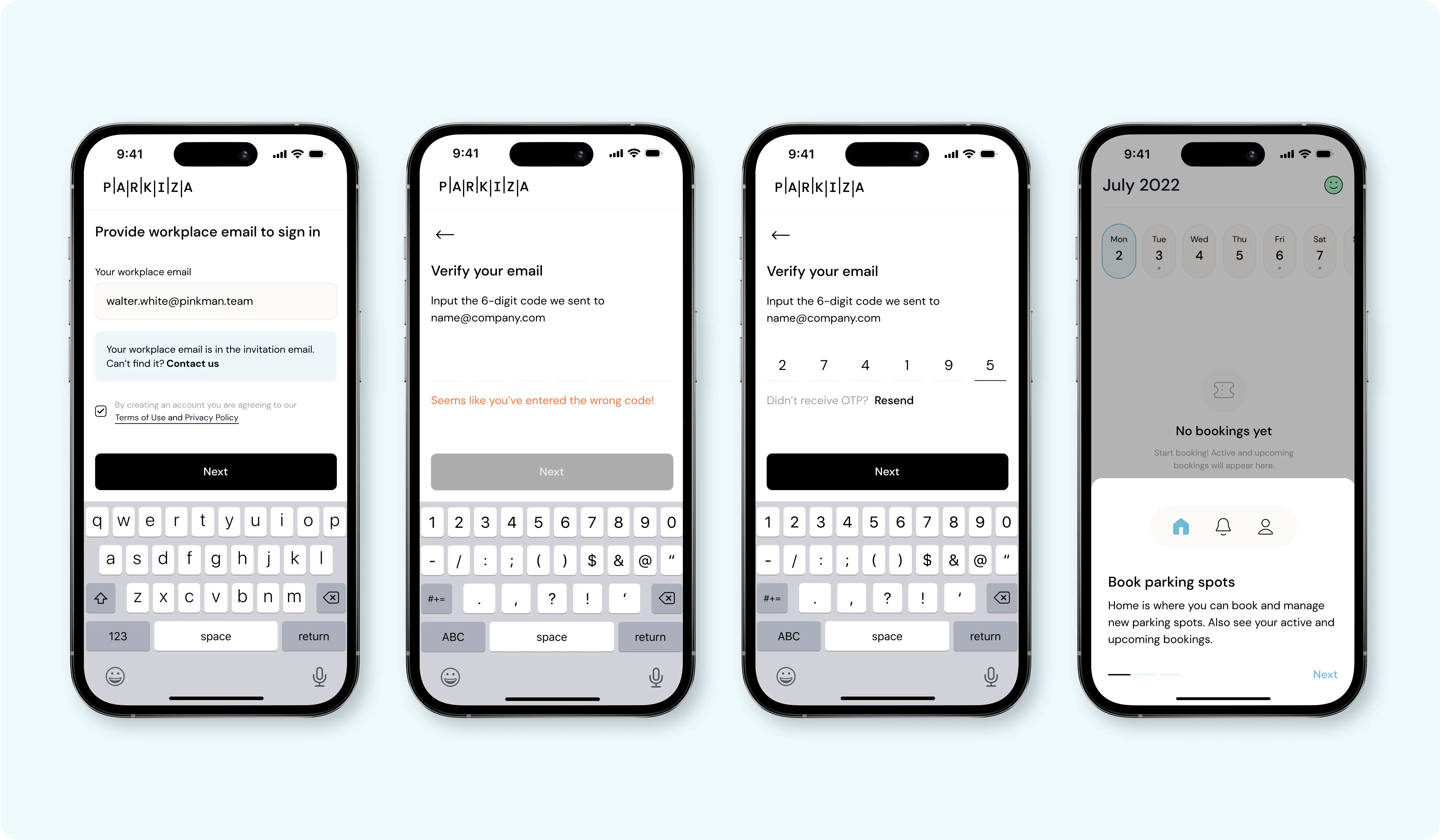
Four iPhone screens displaying a parking app's interface. The first screen shows an email input field for workplace email with 'walter.white@pinkman.team' entered. The second and third screens show email verification with fields to input a 6-digit code, with an error message on the second screen. The fourth screen shows a calendar view with no bookings for July 2022 and an option to book parking spots.

Solutions

Bold Colors in Sleek Design

We adopted a modern, flat, and colorful design to enhance our app's brand, making it more user-friendly and visually appealing. Vibrant colors add dynamism, while our inviting, sophisticated branding appeals to all ages, emphasizing a clean and minimalistic aesthetic. This approach seamlessly blends functionality with style, creating an engaging and accessible interface for every user.

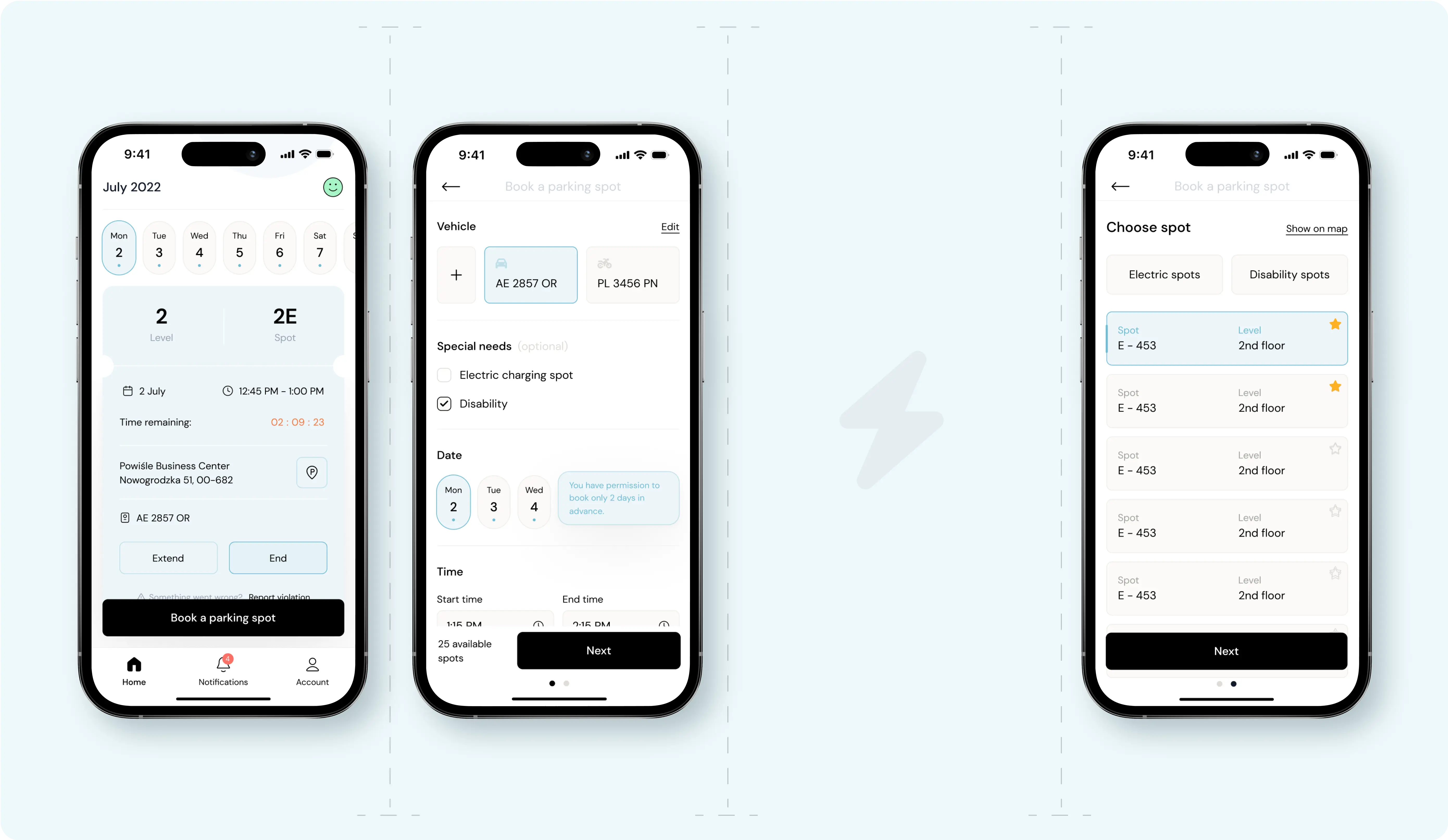
Three iPhone screens displaying the interface of a parking app. The first screen shows a booking confirmation for a parking spot on July 2, 2022, at level 2, spot 2E with a countdown timer. The second screen allows users to book a parking spot by selecting a vehicle, special needs, and date and time. The third screen presents options for choosing a specific parking spot, with tabs for electric and disability spots and a list of available spots on the 2nd floor.
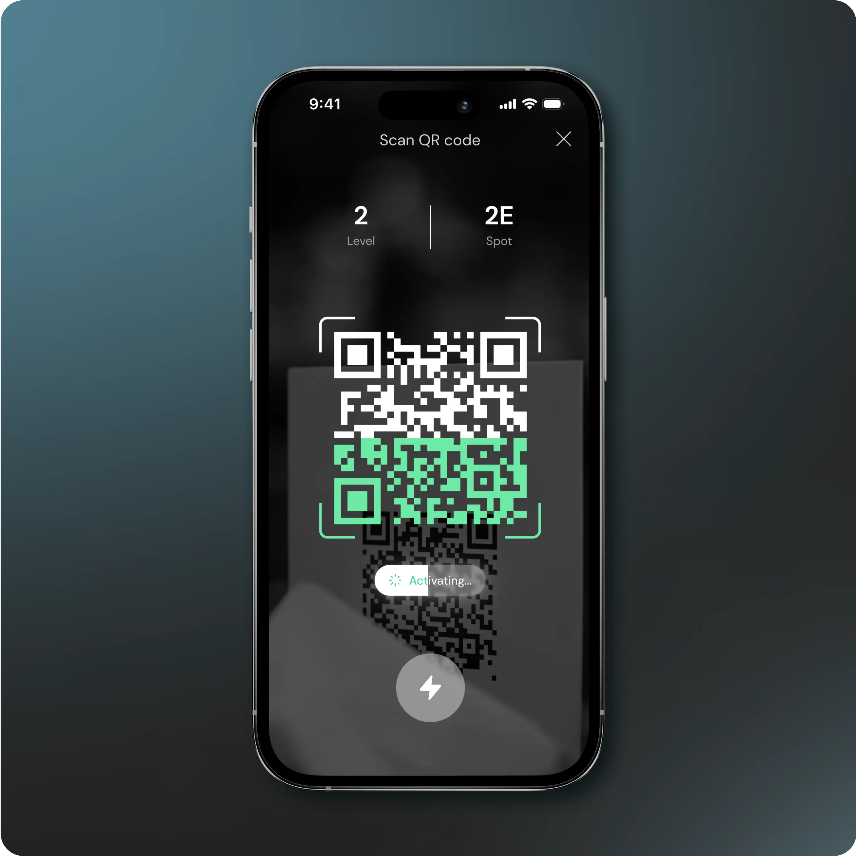
iPhone screen displaying a parking app interface where a QR code is being scanned. The screen shows the level (2) and spot (2E) information at the top, with a QR code in the center being processed. The app indicates that the activation is in progress with a loading animation below the QR code
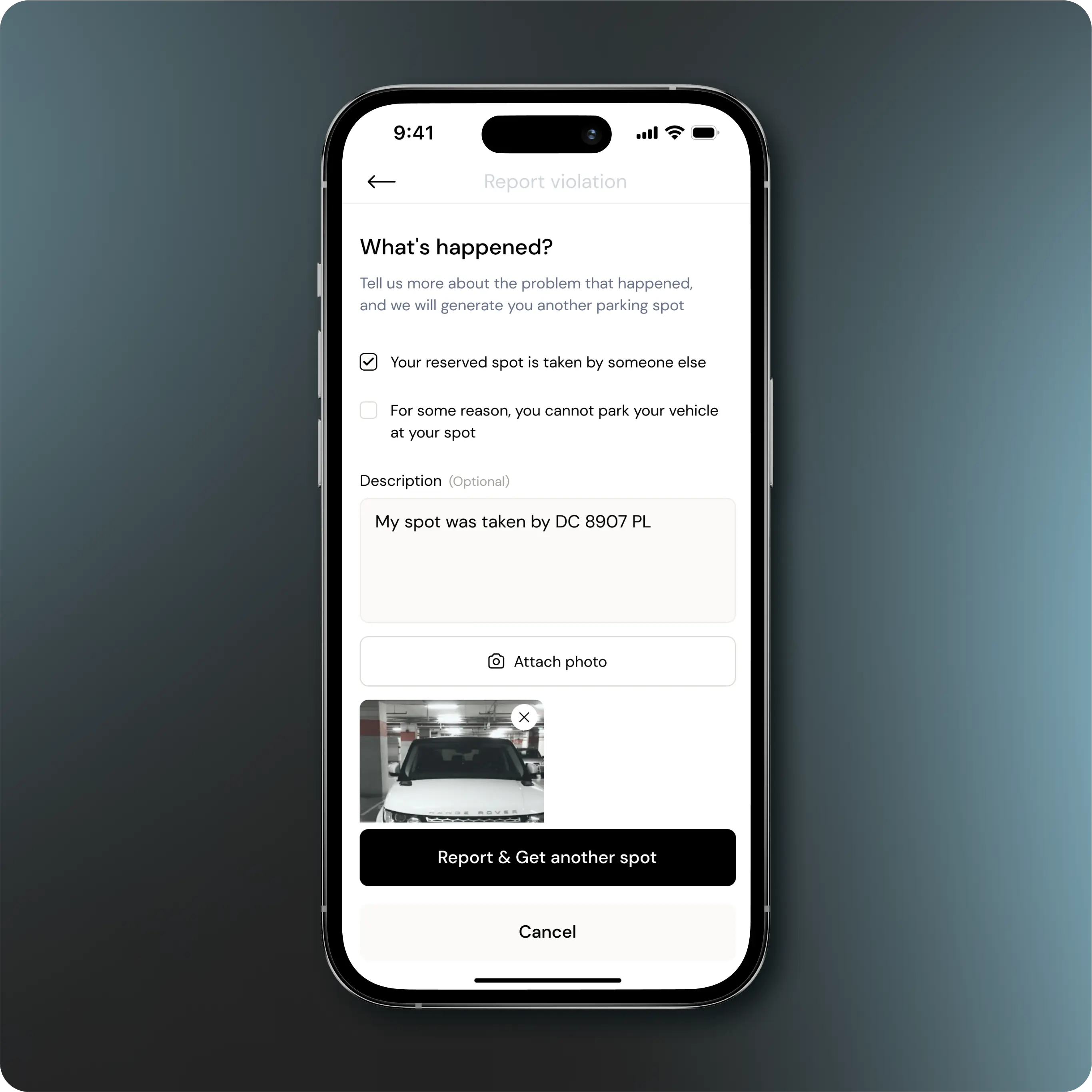
iPhone screen displaying a parking app interface where a user is reporting a parking violation. The screen has a header titled 'What's happened?' with options to describe the issue. The user has selected 'Your reserved spot is taken by someone else' and provided a description: 'My spot was taken by DC 8907 PL'. A photo of the offending vehicle is attached below. At the bottom, there are buttons labeled 'Report & Get another spot' and 'Cancel'.
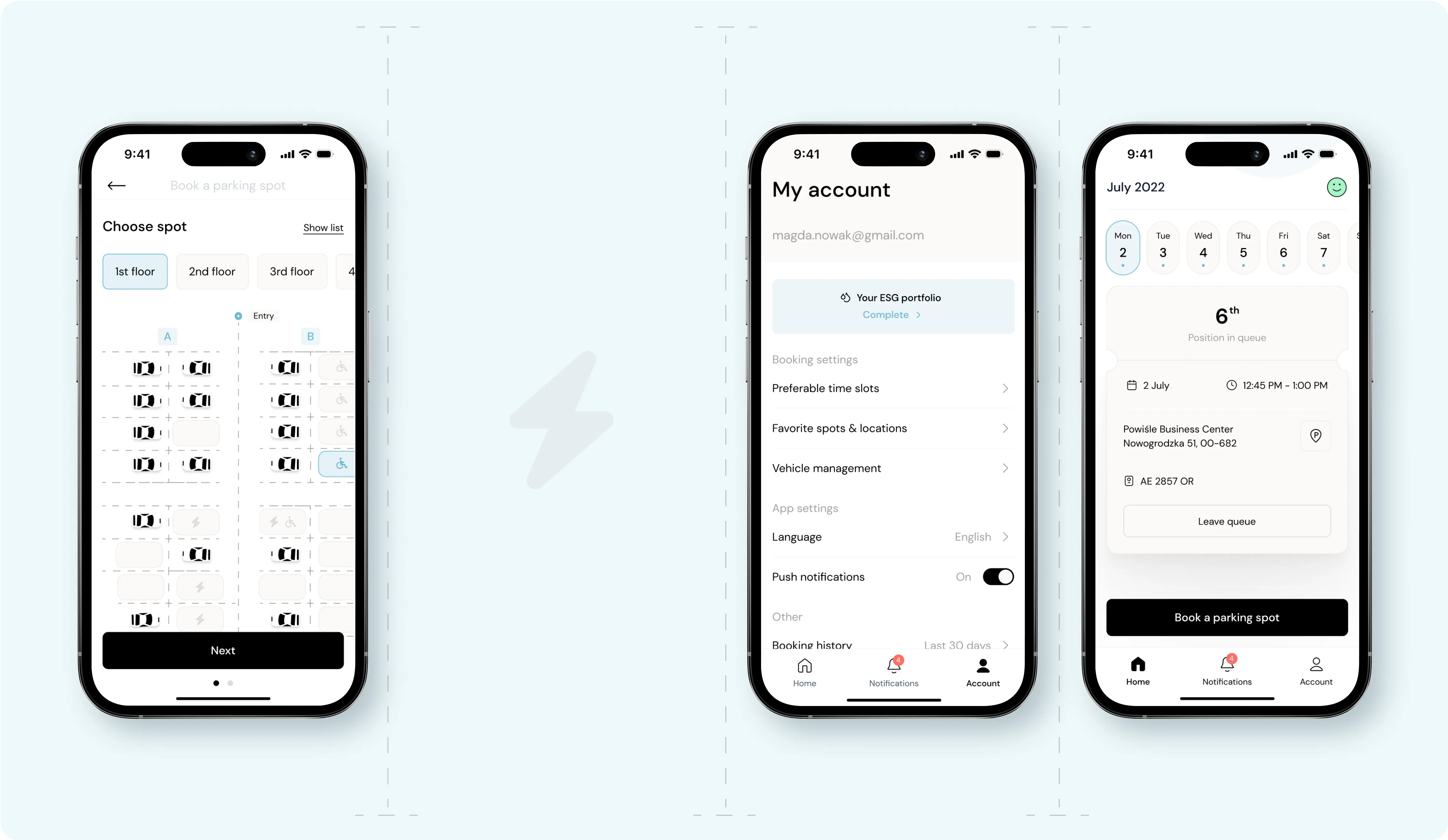
Three iPhone screens displaying different interfaces of a parking app. The first screen shows a 'Choose spot' map layout with various floors listed at the top and parking spots marked on a grid. The second screen displays 'My account' settings, including email, booking settings, app settings, and other options like push notifications and booking history. The third screen shows a booking queue for July 2022, indicating the user's position in the queue, booking details, and a button to 'Leave queue' or 'Book a parking spot' at the bottom.

The Power of Design Components

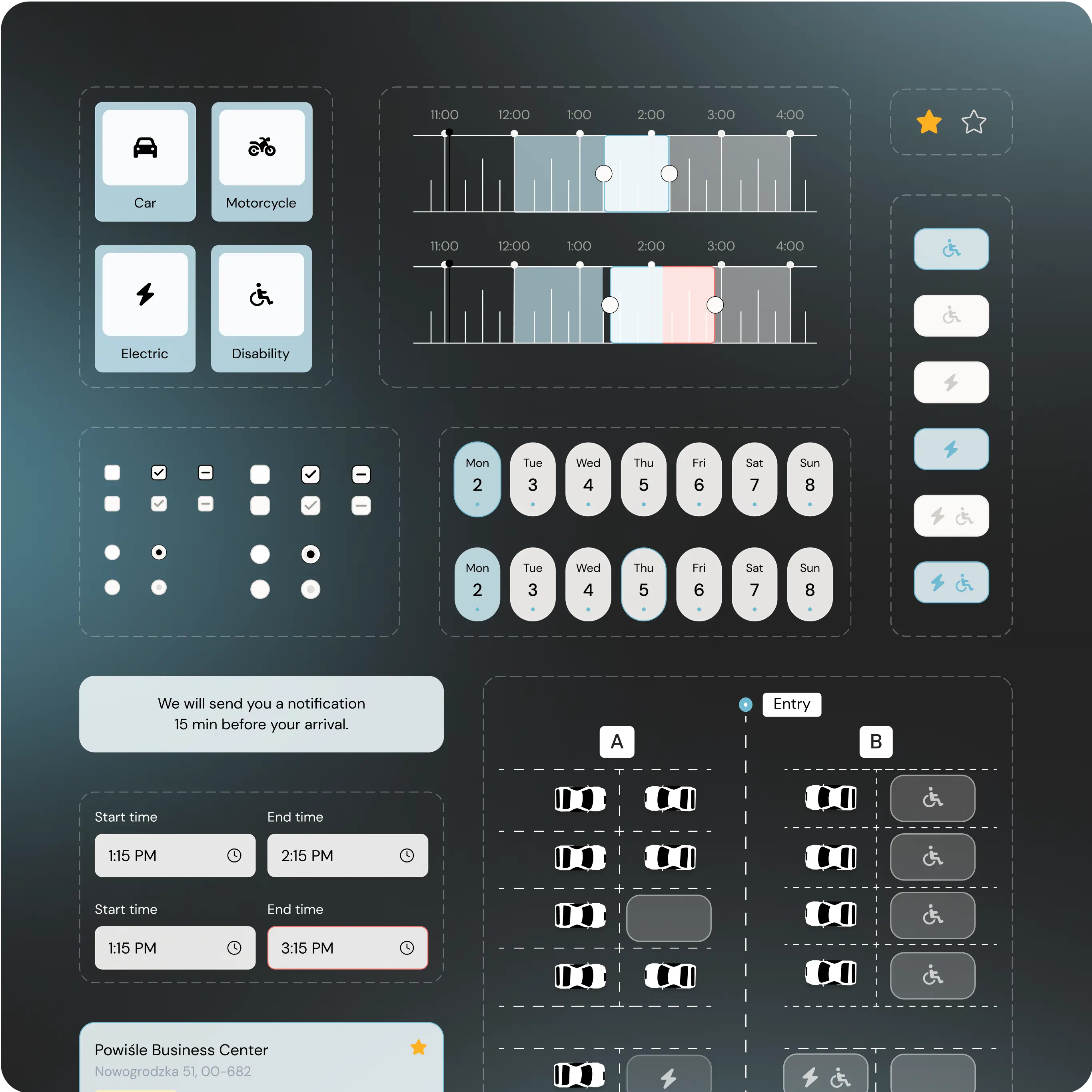
Design components are essential to crafting exceptional user experiences. They ensure a uniform look and feel across various platforms and devices, simplifying interactions to make navigation intuitive. By offering a library of customizable, reusable components, they significantly cut down development time and costs. Moreover, these components furnish users with a familiar interface, enhancing usability and elevating the overall product experience.

An interface design mockup of a parking app displaying various elements and options. At the top left, there are icons for selecting the type of vehicle: car, motorcycle, electric, and disability. To the right, there are timeline sliders for setting time slots, and below them are date selectors for choosing the days of the week. Various toggle buttons and radio buttons for different settings are shown. The bottom section includes a notification message, start and end time selectors, and a map layout with parking spots and icons indicating special spots like disability and electric charging. The app also indicates the location as Powisle Business Center.
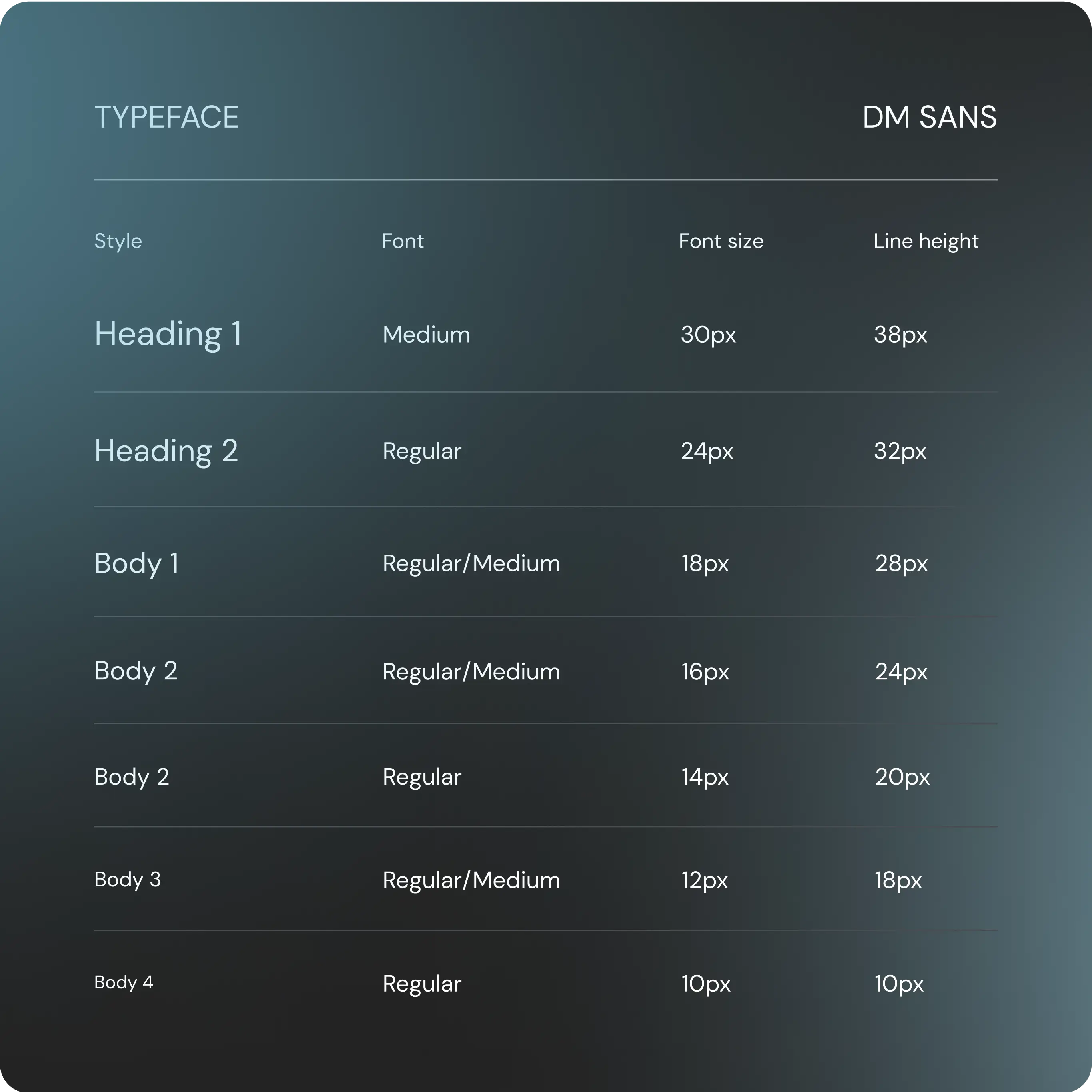
Typography guidelines for the typeface 'DM Sans' used in a design system. The chart lists various styles, fonts, font sizes, and line heights.  Heading 1: Medium, 30px font size, 38px line height Heading 2: Regular, 24px font size, 32px line height Body 1: Regular/Medium, 18px font size, 28px line height Body 2: Regular/Medium, 16px font size, 24px line height Body 2 (alternative): Regular, 14px font size, 20px line height Body 3: Regular/Medium, 12px font size, 18px line height Body 4: Regular, 10px font size, 10px line height The background is a gradient dark teal.
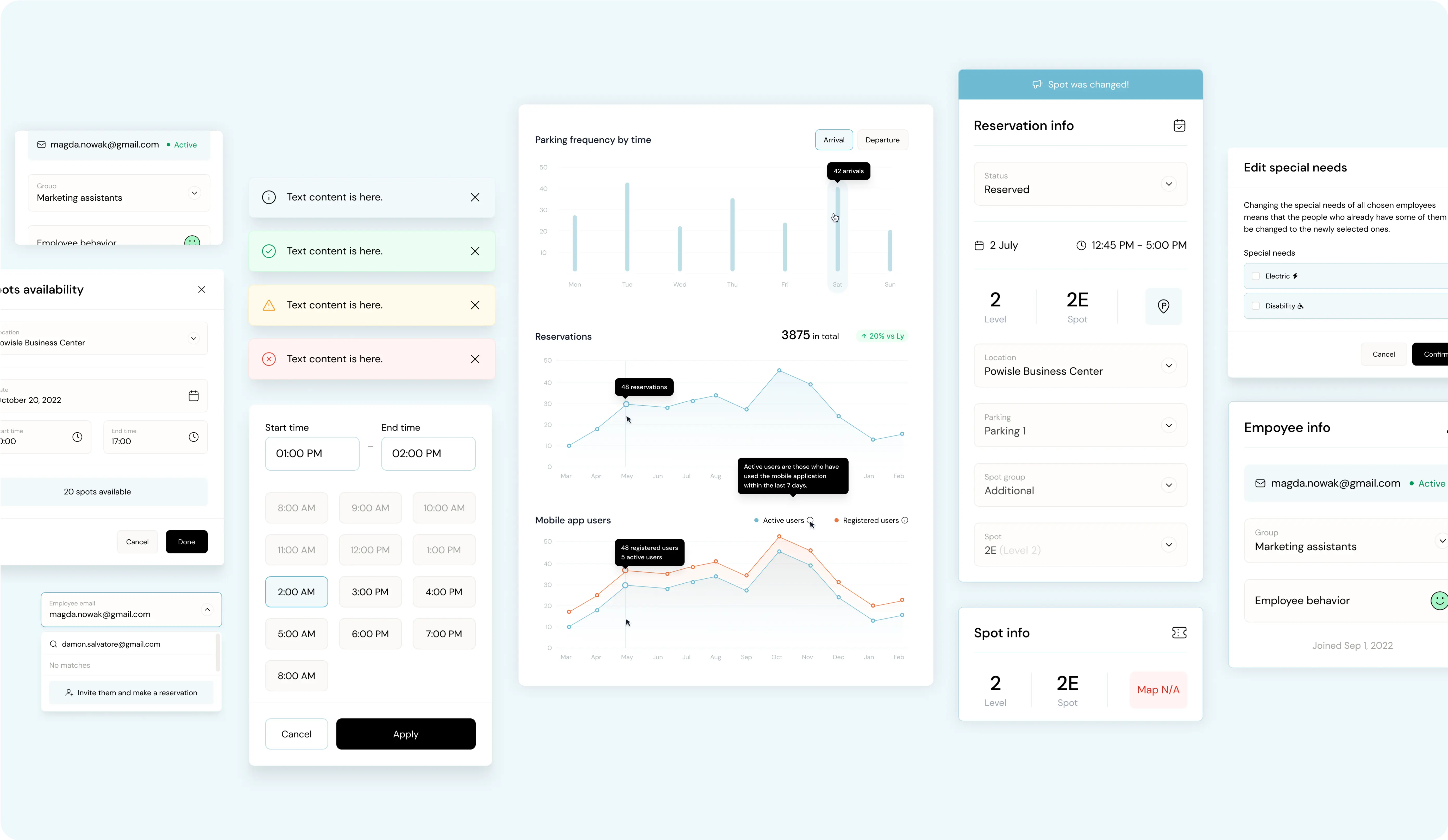
A dashboard displaying various interface elements and data visualizations related to parking management. The dashboard includes:  A user profile section with the email magda.nowak@gmail.com and the group 'Marketing assistants'. Notifications with different colored backgrounds for informational, success, warning, and error messages. A section for checking parking spot availability with options to select dates and times. A line graph showing 'Parking frequency by time' and 'Reservations', indicating the number of reservations and active users over time. A bar chart displaying 'Mobile app users' with a comparison between active users and registered users. A reservation info panel showing details for a reserved spot on July 2nd from 12:45 PM to 1:00 PM at Powisle Business Center, level 2, spot 2E. A section for editing special needs with options for electric and disability parking spots. A time selection panel to choose start and end times. An employee info panel with the user email magda.nowak@gmail.com, group 'Marketing assistants', and the 'Employee behavior' status. A section for inviting employees to make a reservation by entering their email address.

"Seeing the app come to life, knowing it streamlines the daily routines of its users, and reduces administrative burdens, has been a true highlight of my design career. This project not only pushed my creative boundaries but also reinforced the impact thoughtful design can have on making everyday tasks more efficient and inclusive."

Darina Khomenko

HEAF OF DESIGN OPERATIONS AT RASA DESIGN TEAM

Insights and Automation for Better Management

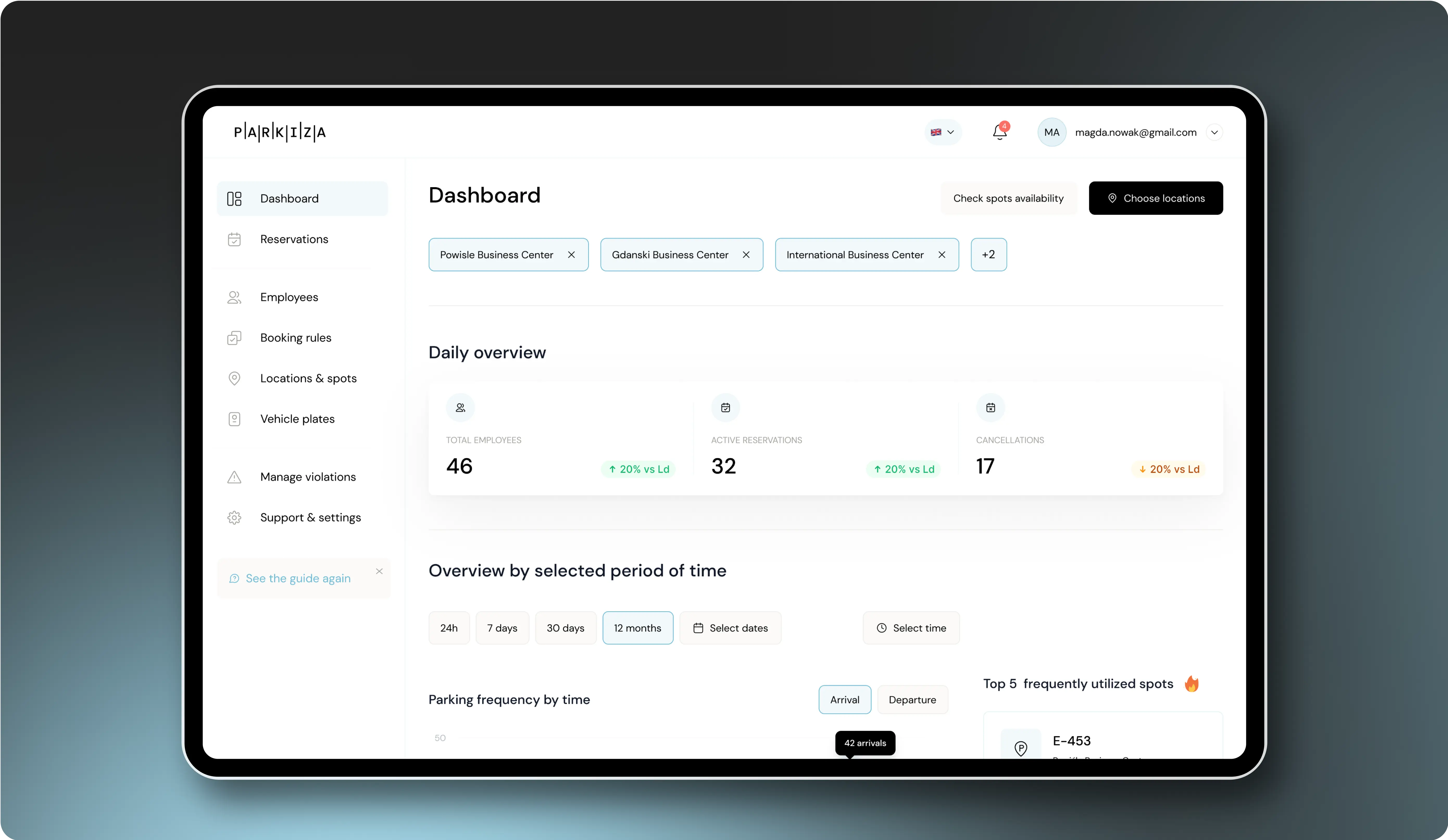
We've streamlined the administrative workload in managing a fair parking booking system. Admins can now set rules and customizations effortlessly, turning parking management into an automated process with minimal manual intervention. Moreover, admins gain insights into parking lot utilization — tracking bookings, timings, quantities, and preferred areas. This valuable data aids in optimizing parking use and enhancing the experience for both staff and visitors.

Tablet displaying the 'Dashboard' section of the Parkiza app. The screen shows:  A top navigation bar with user profile (magda.nowak@gmail.com), notifications, and language settings. A main panel with a 'Daily overview' of parking activity: Total Employees (46), Active Reservations (32), and Cancellations (17). A section for 'Overview by selected period of time' with options for 24h, 7 days, 30 days, 12 months, Select dates, and Select time. A 'Parking frequency by time' chart for arrivals and departures. A 'Top 5 frequently utilized spots' list. A left sidebar menu with options for Dashboard, Reservations, Employees, Booking rules, Locations & spots, Vehicle plates, Manage violations, and Support & settings.
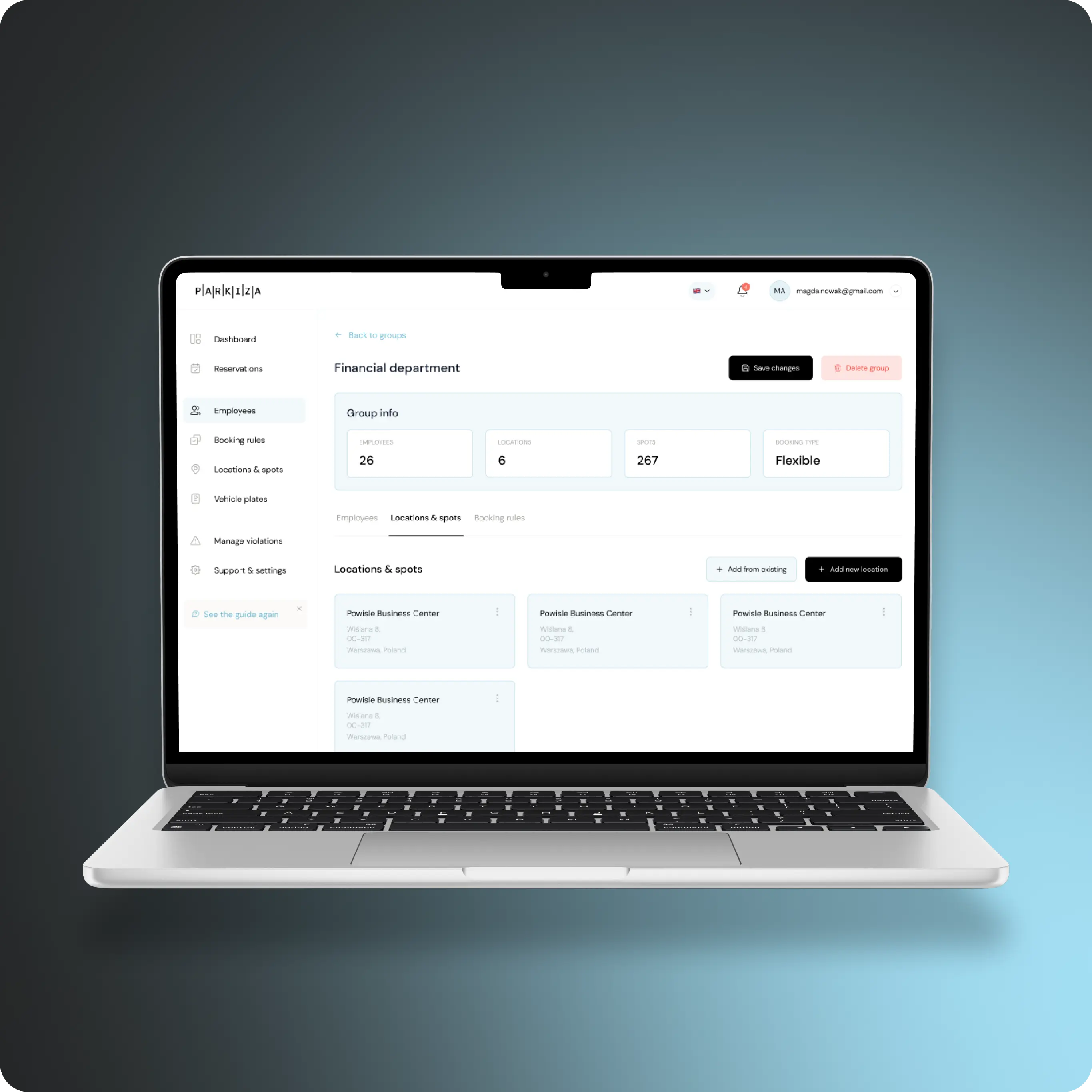
Open laptop displaying the 'Financial Department' section of the Parkiza app. The screen shows:  The 'Group Info' panel with details: 26 employees, 6 locations, 267 spots, and booking type 'Flexible'. Tabs for Employees, Locations & spots, and Booking rules. The 'Locations & spots' tab is active, listing several entries for 'Powiśle Business Center' with address details in Warsaw, Poland. Buttons for 'Add from existing' and 'Add new location'. The left sidebar menu includes options for Dashboard, Reservations, Employees, Booking rules, Locations & spots, Vehicle plates, Manage violations, and Support & settings.
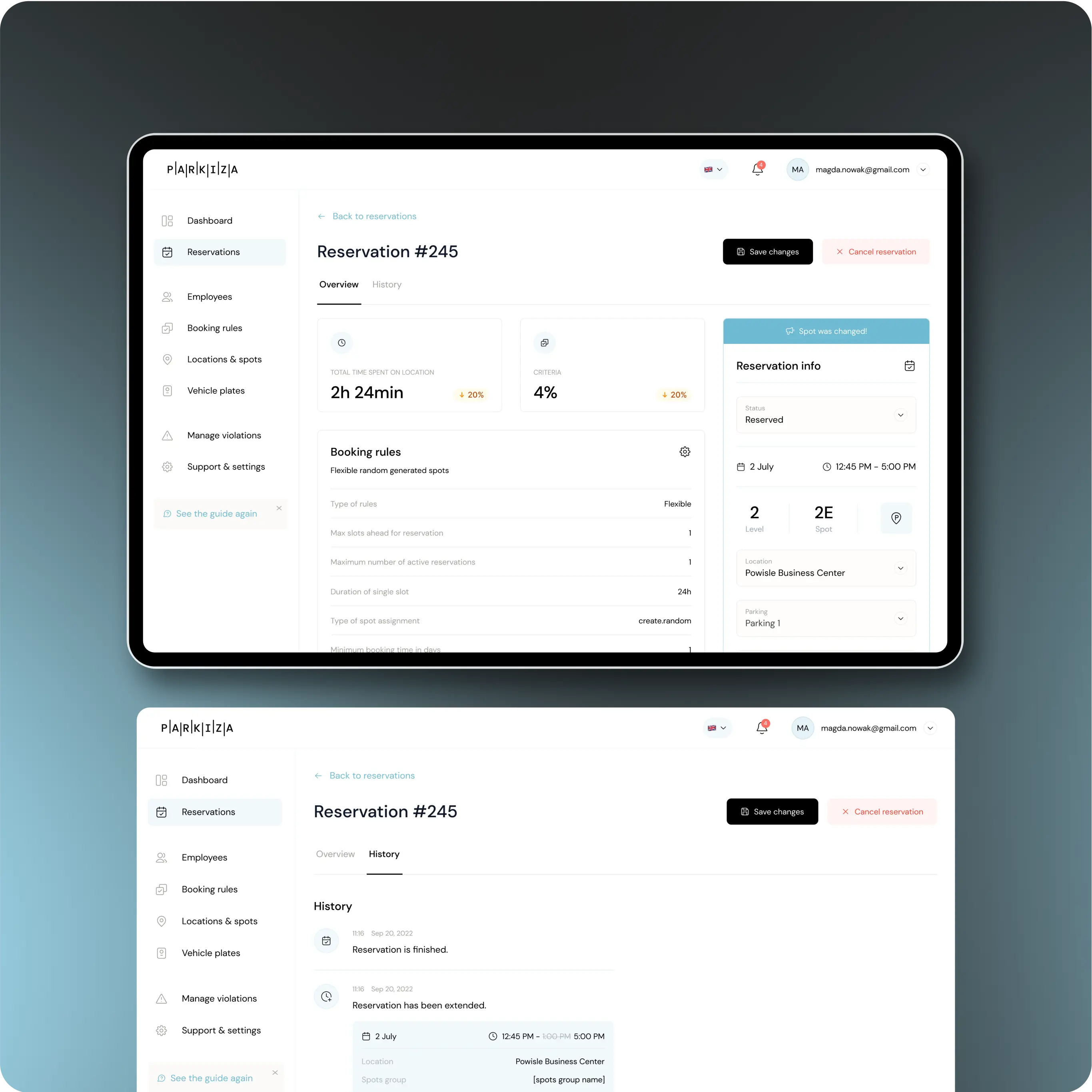
Two tablet screens displaying the Reservation section of the Parkiza app.  The first screen shows:  The overview of Reservation #245. Key metrics include total time spent on location (2h 24min), a 20% increase, and criteria met at 4%, also a 20% increase. Details about booking rules, including type of rules (flexible), max slots chosen for reservation, maximum number of active reservations, duration of single slot (20h), type of spot assignment (create random). Reservation info with status (reserved), date (2 July), time (12:45 PM - 5:00 PM), level (2), spot (2E), location (Powiśle Business Center), and parking (Parking 1). The second screen shows:  The history of Reservation #245. The history entries include the reservation being finished on Sep 20, 2022, and the reservation being extended to 12:45 PM - 5:00 PM on the same day. The left sidebar menu includes options for Dashboard, Reservations, Employees, Booking rules, Locations & spots, Vehicle plates, Manage violations, and Support & settings.
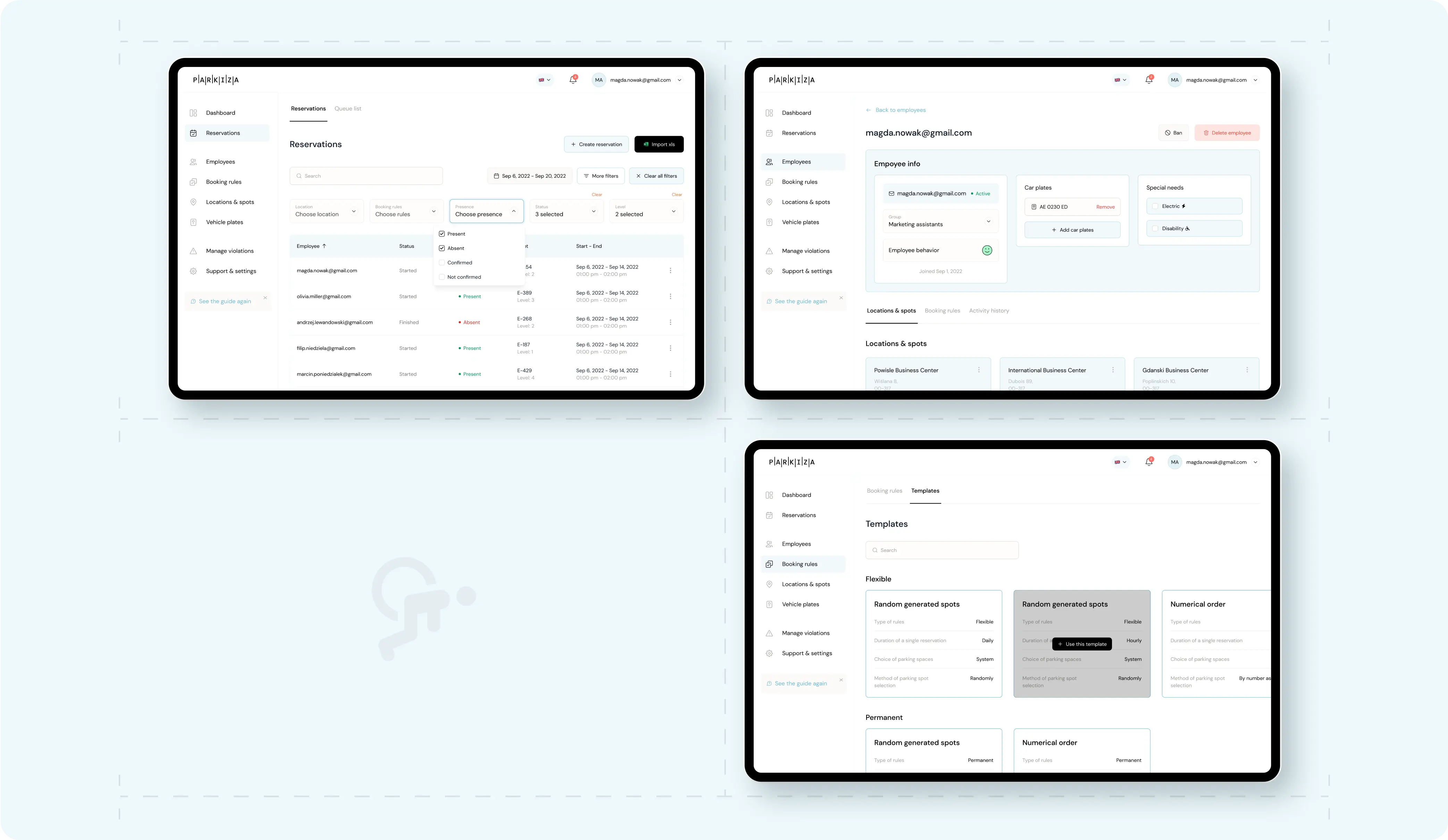
Three tablet screens displaying different interfaces related to parking management in the Parkiza app.  The first screen shows the 'Reservations' section with a list of reservations including details such as location, employee names, booking status, and presence status (e.g., Present, Absent, Confirmed). There are options to create new reservations and filter by location, booking rules, and presence status.  The second screen displays the 'Employee info' section for an employee with the email magda.nowak@gmail.com. It includes information such as the employee's name, group (Marketing assistants), car plates, and special needs (Electric, Disability). There are options to add or remove car plates and special needs.  The third screen shows the 'Templates' section under 'Booking rules', where different templates for parking spot reservations can be created. The templates include options for flexible and permanent random generated spots, as well as numerical order based on different rules such as duration, choice of parking spaces, and method of spot selection.

Parkiza’s Landing: Your First Step

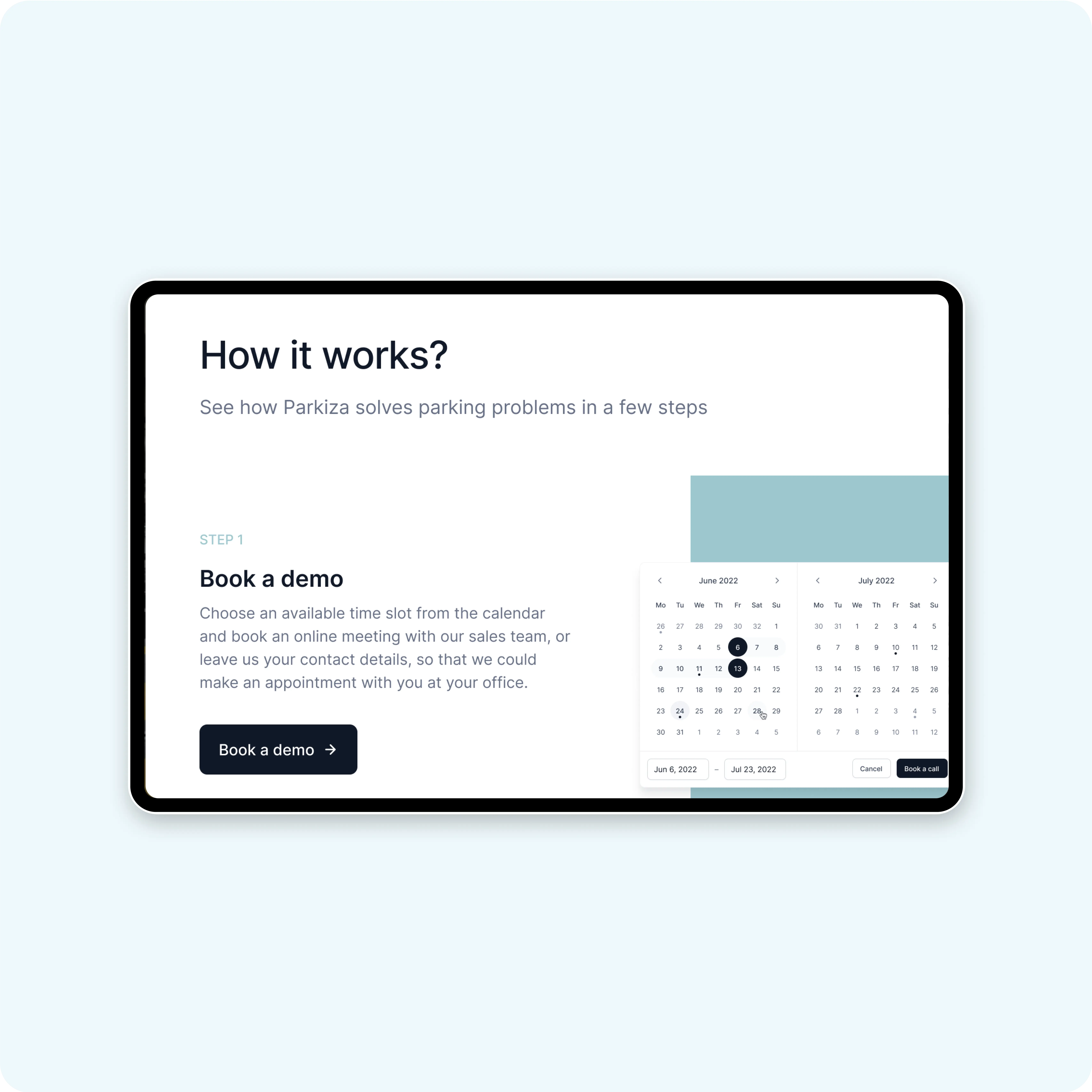
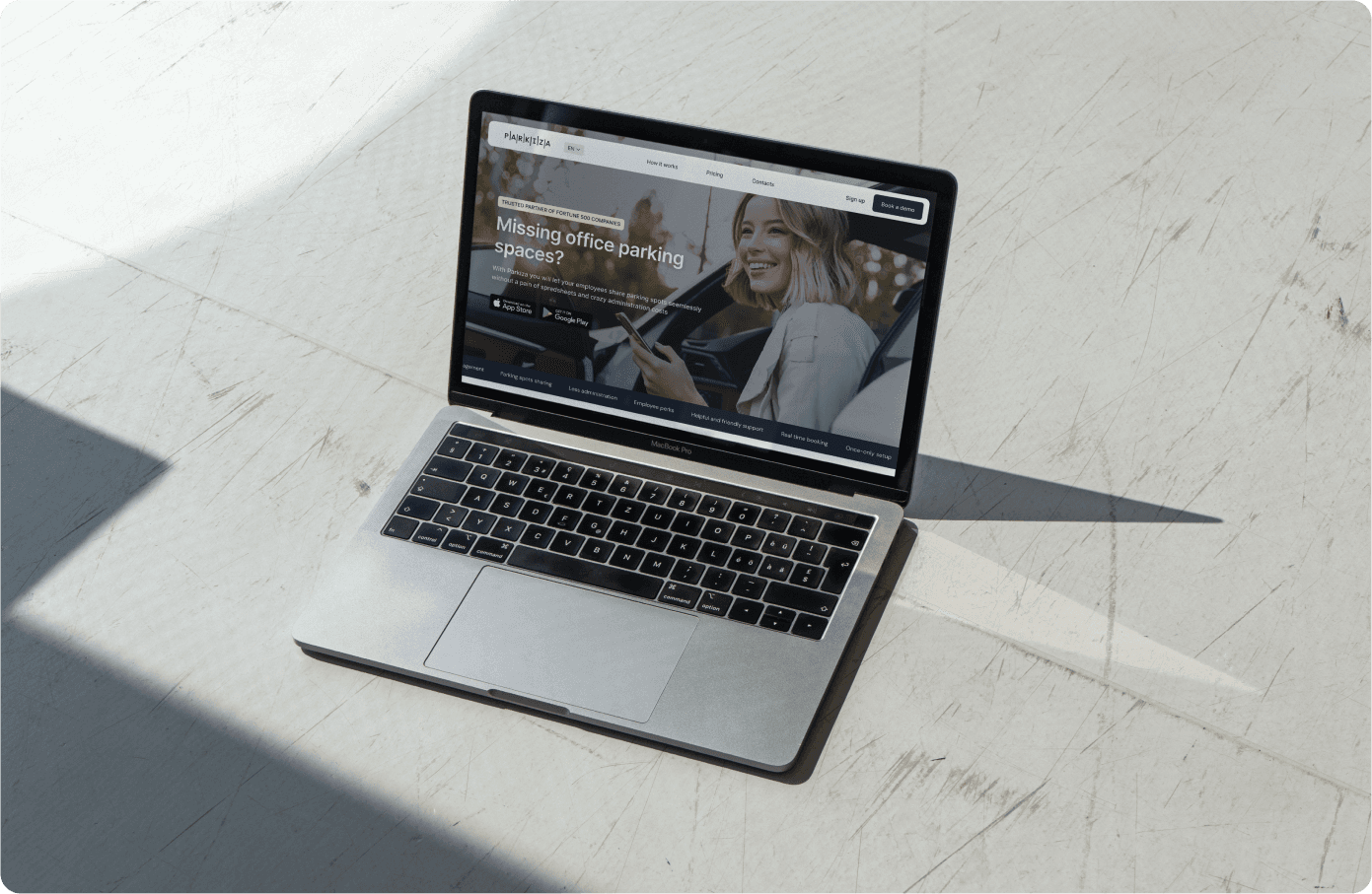
The landing page serves as a pivotal marketing vehicle, vital for business growth. It embodies the brand, showcasing Parkiza's simplicity and convenience through strategic design. Utilizing a card layout, we spotlight our expertise and services, enabling visitors to grasp our company's essence in mere seconds.

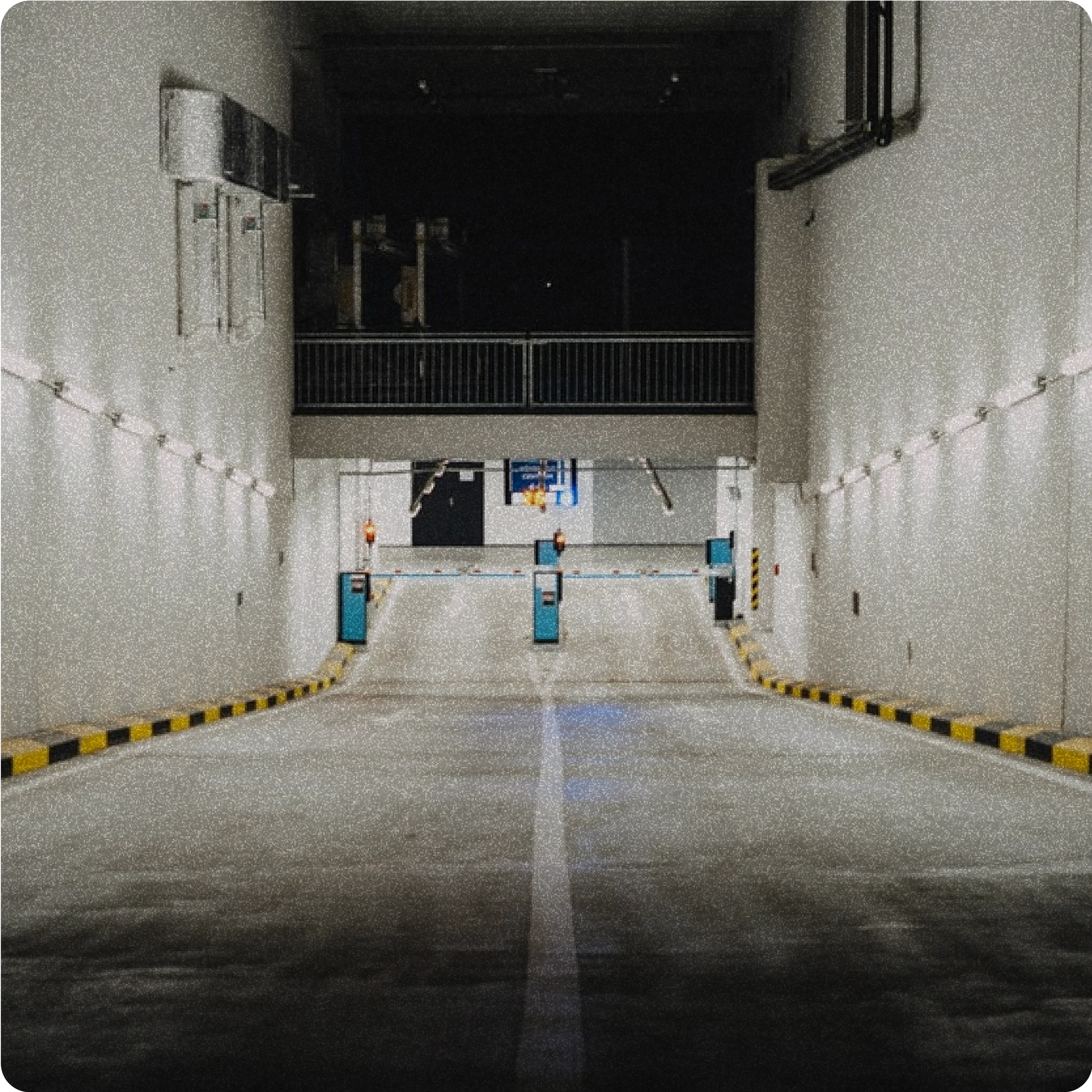
Entrance to an underground parking garage, illuminated by overhead lights, featuring a ramp with barriers and security equipment.
A tablet screen displaying a webpage section titled 'How it works?' with a description of how Parkiza solves parking problems in a few steps. The first step is 'Book a demo,' where users can choose an available time slot from the calendar and book an online meeting with the sales team. There is a calendar interface and a 'Book a demo' button visible.
A MacBook Pro laptop on a white marble surface displaying the Parkiza website. The website shows a banner with a smiling woman using her phone and text that reads: 'Missing office parking spaces? Parkiza helps you and your employees share, track and manage parking spaces seamlessly from your phone or desktop.' There are buttons for downloading the app from the App Store and Google Play. The top navigation bar includes options for 'How it works,' 'Pricing,' 'Resources,' 'About,' 'Contacts,' and a 'Sign up' button. There is also a 'Book a demo' button on the right side of the banner.

With thanks to Iza Marciszak, Emil Kamiński, and the incredible Parkiza team for all their collaboration across the working process. Huge thanks to Darina Khomenko and Yasemin Ibrahimagaoglu — each day you shine brighter and impress us more and more with your design skills! We still cannot believe how lucky our team is to have you here!

Subscibe to RDT Newsletter

So rare, it’s not yet in existence.

You could be the first to read... well, something, eventually.

© 2024 Rasa Design Team

All rights reserved

Subscibe to RDT Newsletter

So rare, it’s not yet in existence.

You could be the first to read... well, something, eventually.

© 2024 Rasa Design Team

All rights reserved

Subscibe to RDT Newsletter

So rare, it’s not yet in existence.

You could be the first to read... well, something, eventually.

© 2024 Rasa Design Team

All rights reserved